
Converse: Brand Identity

Feb 2020
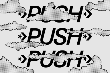
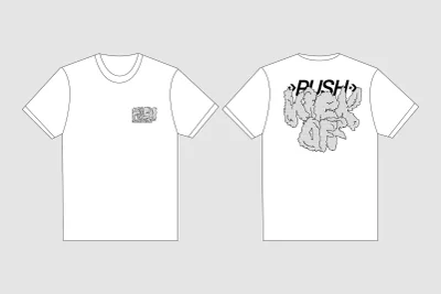
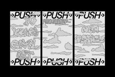
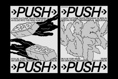
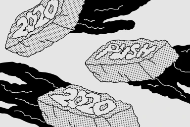
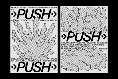
The latest brand identity project for Converse, titled PUSH, masterfully captures the intersection of streetwear and urban skate culture through a raw, high-contrast visual language. Developed by Daily Dialogue, this comprehensive design system serves as the backbone for a new cultural skate initiative based in Berlin. The project leans heavily into a gritty, zine-inspired aesthetic that feels both modern and rooted in the rebellious spirit of street art. By utilizing a stark black-and-white palette, the design team employs vector graphics and intentional halftone dot patterns to create textured, ink-like illustrations that evoke the feeling of vintage comic book art and screen print techniques. The typography, defined by bold sans-serif lettering and hand-drawn bubble accents, provides a structural foundation that balances abstract cloud forms and stippled rock shapes. This graphic consistency effectively scales across a variety of applications, from technical t-shirt mock-ups and detailed event triptychs to clean, editorial-style event posters. By blending artistic flair with a clear commercial utility, the PUSH identity establishes a cohesive look that feels authentic to its skateboarding roots while maintaining a polished professional finish. The effective use of negative space and movement-oriented imagery ensures the brand remains impactful and instantly recognizable, successfully bridging the gap between corporate storytelling and grassroots community engagement within the global fashion landscape.
Artistic, Horizontal, Monochrome, Graphic
Typography
Solid Colour
Advertising Campaign
