
Close Enough: Brand Identity

Jun 2018
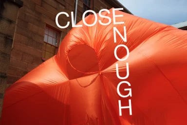
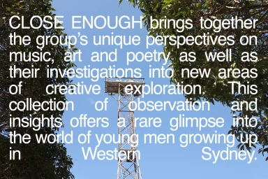
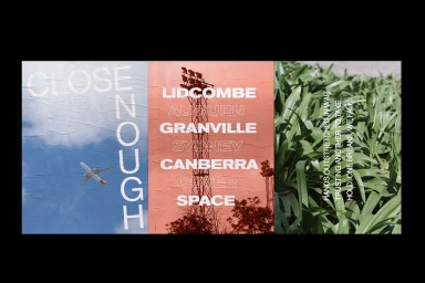
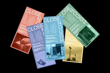
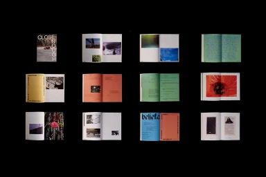
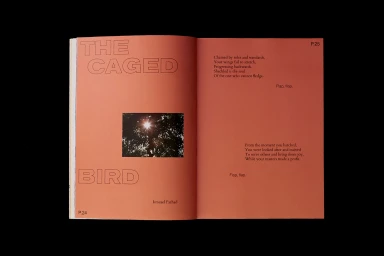
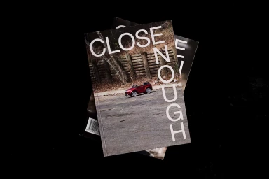
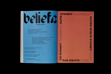
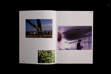
The brand identity for Close Enough, developed by SCCO Studio, serves as a masterclass in experimental editorial design within the digital media and entertainment landscape. By masterfully blending commercial sensibilities with an artistic, modernist edge, the project establishes a cohesive visual language that feels both grounded and expansive. The work leans into a vibrant color palette, utilizing high-contrast color blocking and bold, sans-serif typography to create a sense of rhythmic energy across various touchpoints. From the striking, site-specific installation of a bright orange inflatable structure against textured stone to the intricate multi-page print layouts, the project maintains a consistent tension between minimalism and raw, documentary-style photography. Techniques such as live-action integration and deliberate negative space usage allow the design to shift fluidly between diverse environments, such as urban tunnel photography and natural foliage. This comprehensive approach to brand identity collateral—spanning everything from event flyers to complex editorial booklets—reads as an intentional exploration of storytelling through graphic structure. Ultimately, the project excels by harmonizing varied graphic elements, such as poetic text blocks and vector-based iconography, into a singular, intentional aesthetic that defines the Close Enough brand as a sophisticated player in the contemporary media space, proving that bold typography and thoughtful composition are the keys to a lasting visual impact.
Horizontal
Typography
