
Ragazzi: Brand Identity





Oct 2019
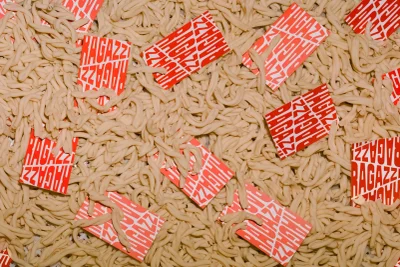
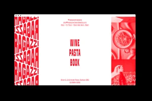
The brand identity for Ragazzi, helmed by the design visionaries at SCCO Studio, captures the essence of contemporary Italian hospitality through a striking, high-contrast visual language. This comprehensive commercial project masterfully balances the warmth of culinary tradition with a sharp, modern aesthetic that feels both approachable and distinct. By leveraging a bold, two-tone color palette of stark white and vibrant red, the studio creates a cohesive system that thrives across diverse touchpoints, from minimalist apparel to intricate UI illustrations and digital interfaces. The work channels an editorial sensibility, utilizing graphic geometric grids and repetitive typography to ground the brand’s identity in a structured, repeatable visual logic. Whether through the artistic top-down flat-lay photography that highlights the raw textures of pasta or the clean, cinematic table settings, the project maintains a sophisticated rigor throughout. The integration of high-key lighting and natural light ensures that the branded elements—such as the stylized Ragazzi lettering and playful motifs—remain the focal point of every composition. By marrying functional, modern vector assets with a warm, lifestyle-oriented approach to food and hospitality, this identity system reads as a seamless fusion of graphic design and culinary storytelling, positioning the brand as a leader in minimalist, impactful visual communication.
Horizontal, Commercial, Clean
Advertising Campaign
