
Alana Wilson: Brand Identity

Nov 2018
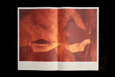
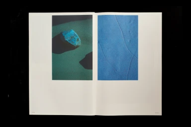
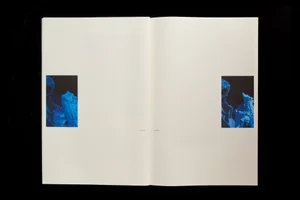
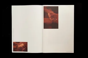
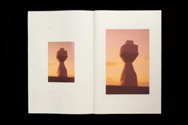
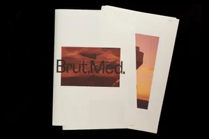
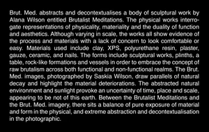
The brand identity for Alana Wilson functions as a masterclass in editorial minimalism, seamlessly bridging the gap between high-end digital media and tactile print design. Through a sophisticated interplay of sharp typography and abstract photography, the identity establishes a contemporary visual language that feels both grounded and deeply artistic. The design system utilizes a high-contrast aesthetic where vibrant, earthy tones—ranging from burnt orange and terracotta to deep, saturated blues—are set against stark negative space. By incorporating editorial photography of geological formations and ceramic sculptures, the identity moves beyond traditional corporate branding, instead opting for a narrative-driven approach that celebrates organic forms and natural textures. The use of clean sans-serif typography, notably the recurring Brut.Med. signature, anchors the layouts, providing a sense of professional clarity that balances the more evocative, macro-level imagery. Executed with precise attention to material quality and composition, the work from SCCO Studio leans into a modern sensibility, emphasizing balance through symmetric layouts and consistent use of white space. This project demonstrates how a cohesive brand identity can effectively leverage editorial techniques and commercial design principles to create a lasting, immersive impression. By focusing on high-contrast lighting and a monochromatic paper palette, the final output feels refined, intentional, and perfectly positioned within the competitive landscape of premium digital media and design-led entertainment.
Editorial, Horizontal, Clean, Minimalist
Typography
Editorial
