
Brand
ProjectBrand Identity
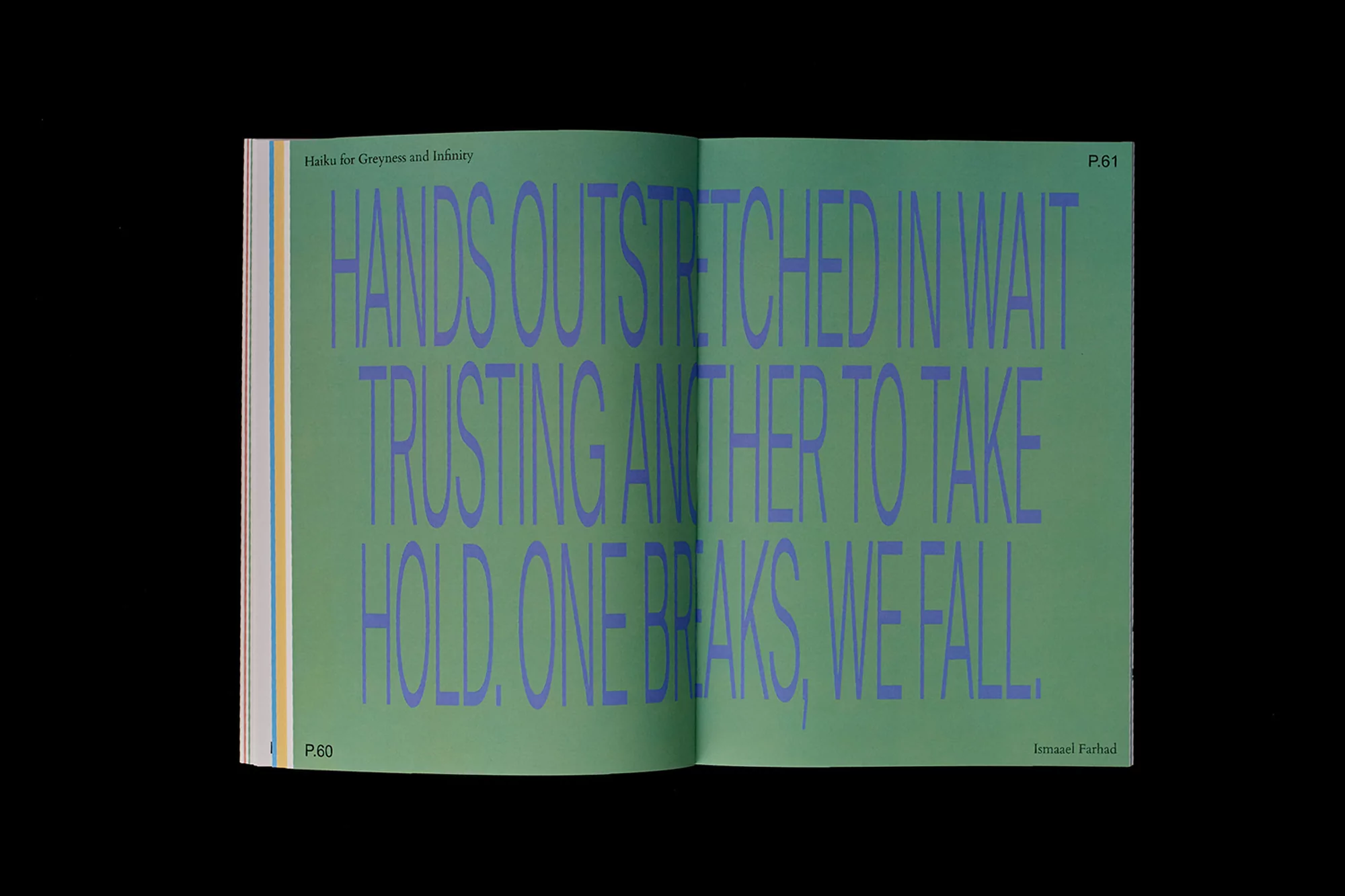
Close Enough Brand Identity 2018
Associated creatives

Tags
Description
An editorial book spread showcasing green pages with bold purple typography set against a solid dark background. Designed by SCCO Studio for the Close Enough brand identity project, the layout displays large condensed sans-serif lettering across opposing pages with page numbers and section headers visible. The composition emphasizes clean graphic design principles, using high-contrast color blocking and precise typography. The image captures the physical book open flat, highlighting the paper texture and binding.