
Brand
ProjectBrand Identity
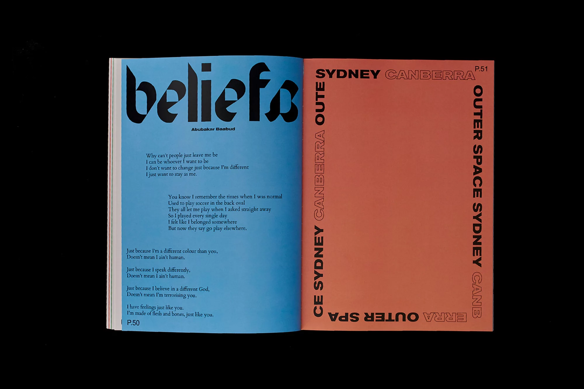
Close Enough Brand Identity 2018
Associated creatives

Tags
Description
An open magazine spread showcases striking graphic design as part of the Brand Identity project for Close Enough. The left page features a vibrant blue background with large black bold typography reading beliefs and accompanying poem text. The right page is styled in an orange tone with vertical text framing reading Sydney and Canberra. The composition highlights minimalist editorial layout principles with contrasting primary color fields and custom font design.