
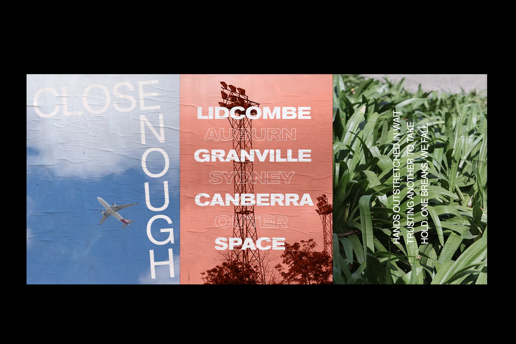
Close Enough Brand Identity 2018
Associated creatives

Tags
Description
This triptych poster design created by SCCO Studio for the brand Close Enough is divided into three distinct vertical panels, each presenting a contrasting photographic scene with typographic overlays. The left panel shows an airplane ascending through a blue sky with white clouds, overlaid with vertical text reading 'CLOSE ENOUGH'. The central panel features a reddish-orange textured background with silhouetted trees, a tall structure resembling a transmission tower, and stacked white location names including 'LIDCOMBE', 'AUBURN', 'GRANVILLE', 'SYDNEY', 'CANBERRA', and 'OUTER SPACE'. The right panel displays a dense cluster of lush green leaves with overlaid text containing prose about trust and holding on. The entire composition is framed against a solid black background.