
Brand
ProjectBrand Identity
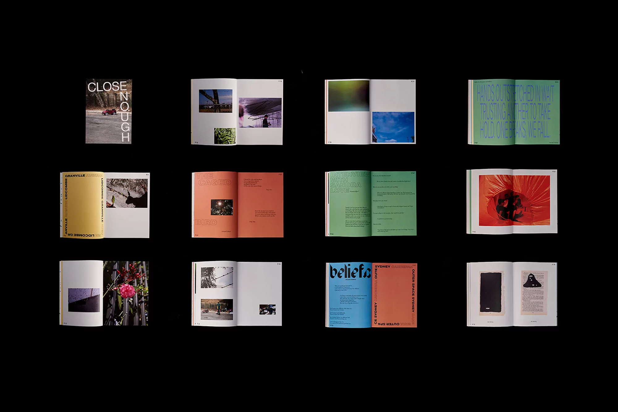
Close Enough Brand Identity 2018
Associated creatives

Tags
Description
This graphic design project showcases a grid of twelve open books and magazines arranged neatly against a stark black background. Each spread displays a distinct layout featuring colorful typography, photography, and editorial design elements. The publication highlights various color palettes including muted greens, vibrant oranges, and striking blues alongside photographic inserts. Created by SCCO Studio for the Close Enough brand identity project.