
CAP Dept.: Brand Identity


Aug 2019
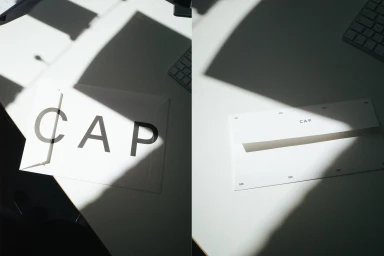
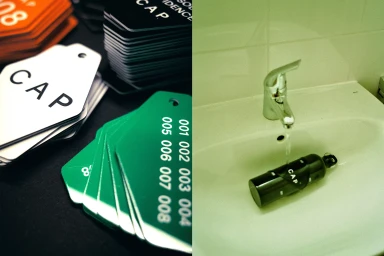
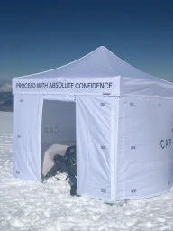
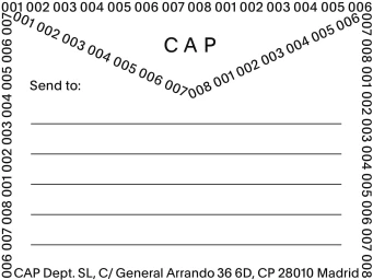
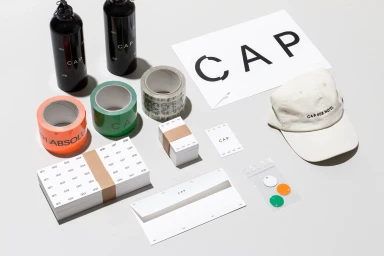
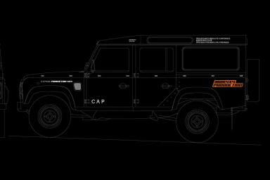
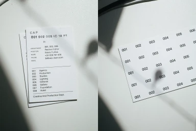
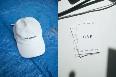
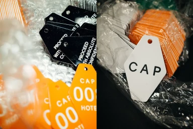
The brand identity project for CAP Dept. functions as a masterclass in modular, information-driven design, transcending the traditional boundaries of corporate collateral to establish a distinct, utilitarian aesthetic. Under the creative direction of Daily Dialogue, the identity leans into a rigorous graphic language characterized by sans-serif typography, numbered sequences, and a disciplined monochrome palette punctuated by vibrant orange and green accents. The execution spans a diverse array of physical touchpoints, from meticulously designed shipping labels and stationery to custom hexagonal identification tags and branded apparel. By balancing corporate professionalism with a rugged, expedition-focused spirit, the design captures an ethos of methodical precision. This is evidenced by the integration of technical automotive schematics alongside pristine lifestyle imagery, such as an all-terrain vehicle staged in a mountainous landscape, which suggests that the brand is built for high-performance environments. Through the use of natural light and chiaroscuro techniques, the imagery emphasizes a high-contrast, minimalist look that feels both cinematic and architectural. Whether it is through the crisp vector illustrations or the tactile, real-world application of branded supplies, the project demonstrates a sophisticated command of print identity and material design. Ultimately, the work positions CAP Dept. as an organization that prioritizes functional clarity and systematic efficiency above all else, ensuring every visual element serves a clear, intentional purpose.
Horizontal, Clean, Commercial, Minimalist
Advertising Campaign
