J E CAI: Brand Identity
Apr 2022
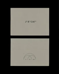
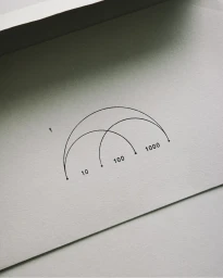
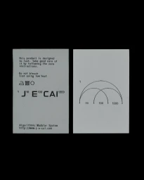
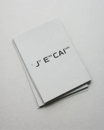
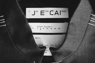
The brand identity for J E CAI centres on a minimalist graphic language, balancing industrial precision with tactile materiality. Developed with graphic design by Daily Dialogue, the system utilises clean typography, modular numerical diagrams, and stark monochrome layouts to establish a consistent aesthetic across print and digital collateral. Photography by Romain Duquesne documents the project’s emphasis on texture and form. From heavy-grain paper stock and embossed labelling to 3D rendered metallic elements, the identity leans into a restrained, architectural sensibility. This cohesive visual framework is applied across business systems, garment tags, and apparel construction details, reinforcing the brand’s technical approach to design.
Minimalist, Clean