
Aurlands
Brand Identity
Feb 2019
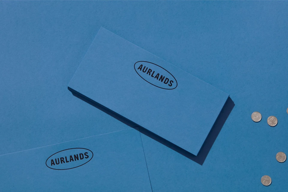
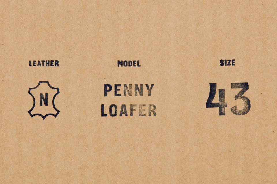
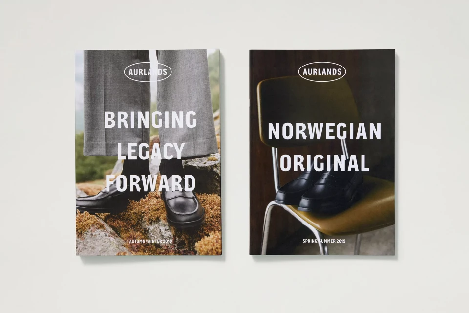
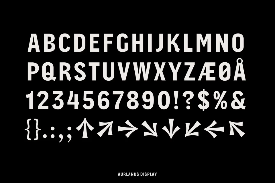
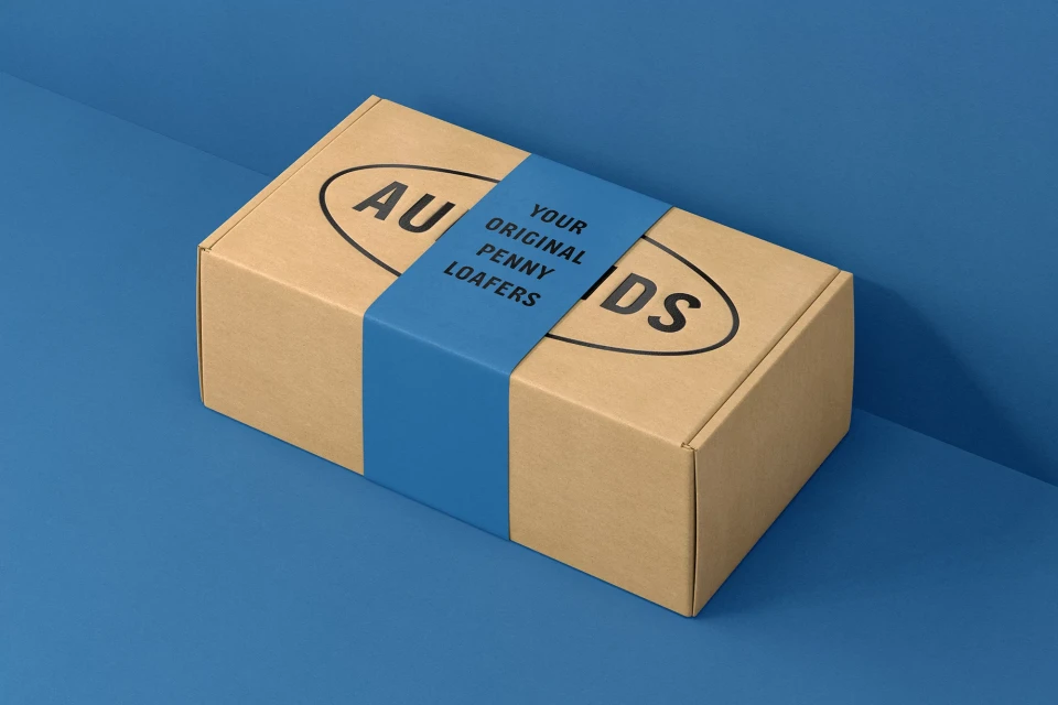
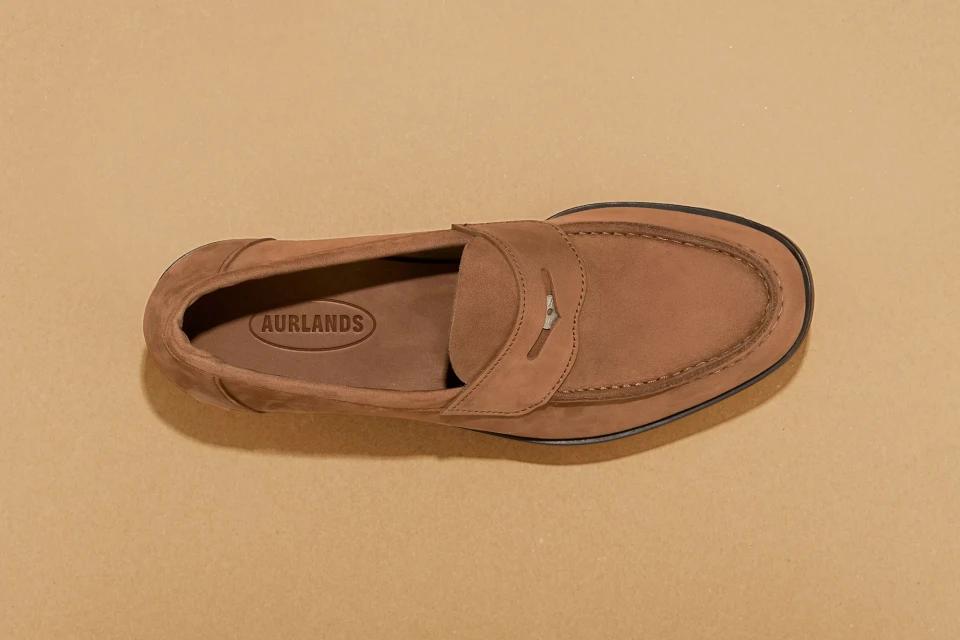
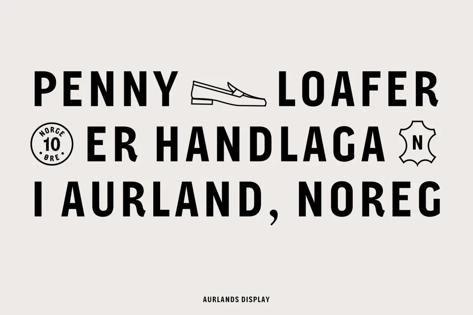
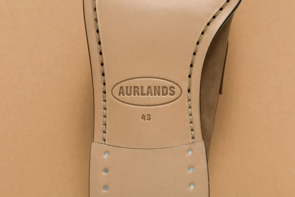
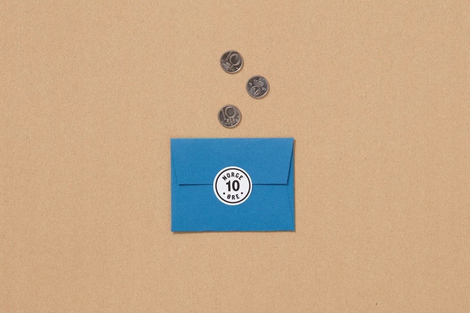
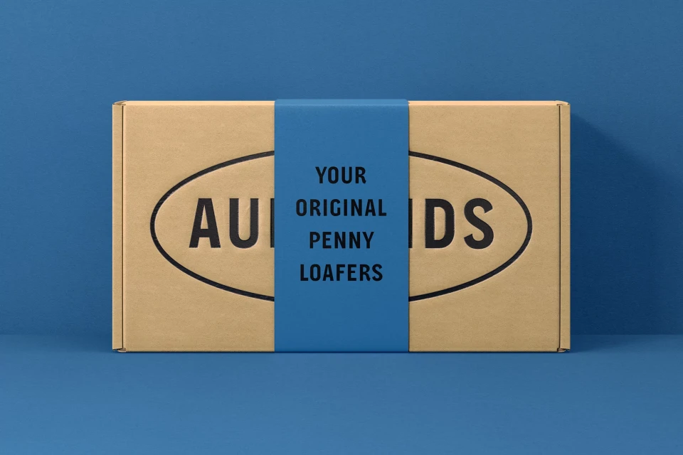
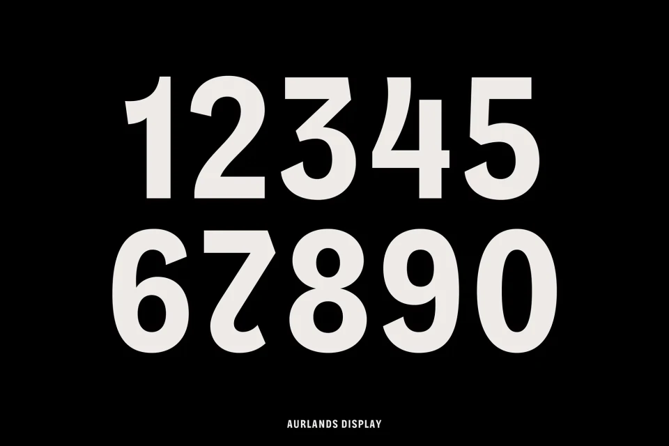
The brand identity for Aurlands meticulously navigates the intersection of historical craft and contemporary design, rooting the heritage of Norwegian footwear in a sleek, modern visual language. Developed by Heydays, the project centers on an editorial approach to commercial assets, balancing high-contrast typography with a distinctive monochromatic blue palette that anchors the brand's premium market position. Through a series of clean, minimalist compositions, the identity system leverages bold sans-serif typefaces and precise geometric logo framing to convey material authenticity. The work extends beyond simple graphics, incorporating custom elements like the Aurlands Display font—complete with specialized Scandinavian character sets—to ensure a cohesive narrative across all touchpoints. By juxtaposing industrial, weathered texture stamps against soft, natural lighting in its product photography, the project successfully elevates the humble penny loafer into an icon of archival prestige. The execution relies heavily on structured flat-lay compositions and deliberate, high-contrast layouts, signaling a shift toward a sophisticated, design-forward aesthetic that honors its origins in Aurland while embracing global minimalism. This comprehensive brand identity is both functional and evocative, successfully synthesizing the tactile quality of leather and cardboard with the precision of vector-based corporate communications, ultimately establishing a robust, scalable visual framework that positions the footwear brand as an essential, timeless authority in the bags and accessories industry.
Horizontal, Commercial, Clean, Minimalist
Typography
Footwear
Advertising Campaign
