
Carrot: Brand Identity


Feb 2022
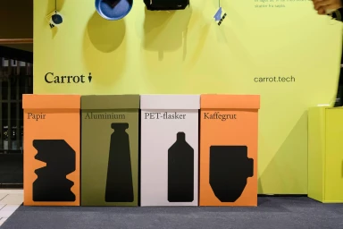
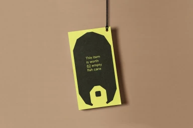
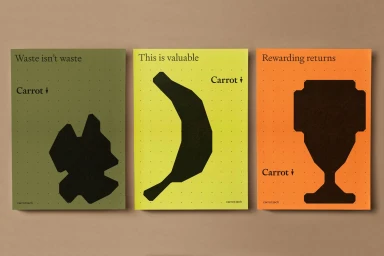
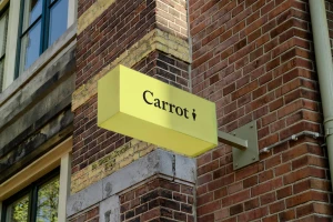
The brand identity for Carrot presents a cohesive visual system built on minimalist graphic design, high-contrast color blocking, and clean typography. Developed by Heydays and Goods, the identity utilizes a distinctive palette of vibrant yellow, olive green, and burnt orange to establish a recognizable visual language. Photography by Hinda Fahre captures the application of these elements across diverse mediums, ranging from urban architectural signage to retail merchandise and screen print posters. The project incorporates motion graphics and fluid animation, featuring dynamic vector silhouettes that reinforce the brand's geometric focus. By integrating functional elements like sorting bin labels and hanging price tags with artistic outdoor installations, the work demonstrates a versatile approach to visual storytelling that balances utility with a clean, contemporary aesthetic.
Horizontal, Commercial, Clean
Advertising Campaign


