
Durasein: Brand Identity

Jun 2020
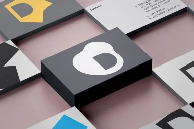
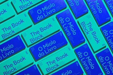
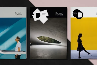
The Durasein brand identity project represents a masterclass in corporate design, weaving together a cohesive visual language that feels both modern and tactically grounded. By synthesizing a range of graphic assets—from precise 3D render/CGI business card mock-ups to minimalist, typography-led layouts—the project establishes a high-contrast aesthetic that commands attention without relying on excess. The identity leans into editorial minimalism, utilizing a sophisticated interplay of bold sans-serif typefaces and organic shapes, particularly the recurring D-shaped logo, to build a distinct institutional presence. Across the collateral, including brochure covers and print materials, the design team leverages a restrained color palette punctuated by vibrant cyan, deep royal blue, and soft coral to create a balanced visual hierarchy. The integration of halftone dot patterns and matte surfaces adds a layer of depth, ensuring the brand identity feels as tangible as it is digital. This work, attributed to the collective efforts of studios including Re, Heydays, and Newlyn, prioritizes clean lines and balanced negative space to elevate Durasein from a mere entity into a curated visual experience. By focusing on professional clarity and geometric precision, the identity succeeds as a versatile tool for corporate communications, proving that modern brand design relies on the rigorous application of typography, vector-based graphic elements, and intentional, clean composition to resonate with contemporary audiences.
Horizontal, Commercial, Clean, Minimalist


