
Whereby: Brand Identity

Dec 2019
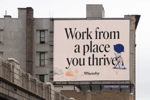
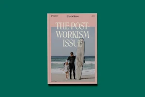
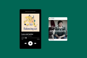
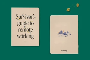
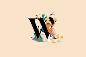
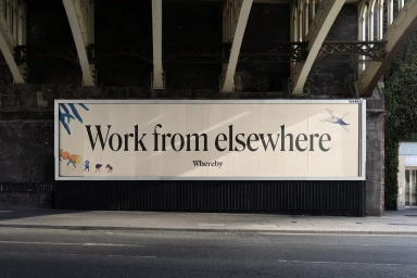
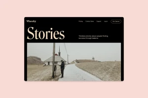
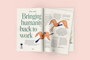
Whereby, a leader in the apps and digital platforms space, has unveiled a comprehensive brand identity that masterfully bridges the gap between professional efficiency and human-centric design. Executed with the creative expertise of Heydays, the project establishes a cohesive visual language that functions seamlessly across diverse touchpoints, from expansive outdoor billboards and editorial publications to intricate UI illustration. The identity leans into a sophisticated, editorial aesthetic, characterized by an elegant serif typeface and a muted, earthy color palette that signals both reliability and warmth. By integrating artistic vector elements and whimsical, hand-drawn figures alongside clean, minimalist layouts, the brand avoids the sterile trap of many technology firms, instead leaning into a more tactile and approachable reality. This is most evident in the brand's magazine spreads and print collateral, where a deliberate use of negative space and soft light elevates the technical messaging of remote work culture into a thoughtful lifestyle narrative. Whether displayed on a digital interface or a physical notebook, the design maintains a high level of balance and hierarchy. This professional, artistic approach ultimately reinforces Whereby's core mission of bringing humanity back to work, ensuring that the brand feels as human as the connections it facilitates through its communication platform.
Commercial, Clean, Horizontal, Minimalist
Solid Colour
