
Generaxion: Brand Identity
Feb 2021
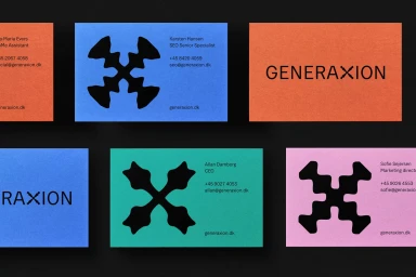
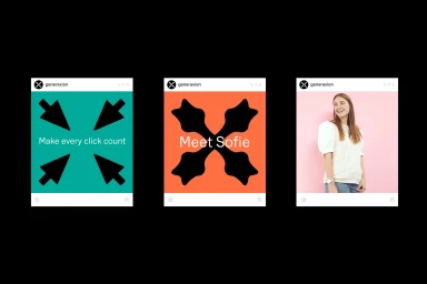
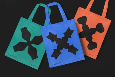
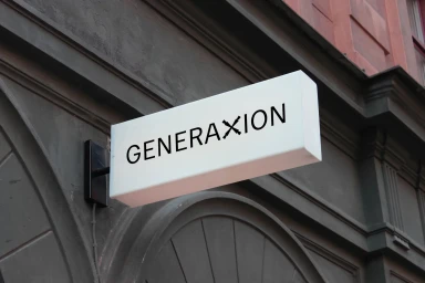
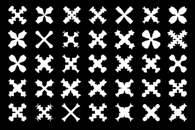
Generaxion’s brand identity project establishes a visual system defined by its minimalist aesthetic and bold, geometric iconography. Developed with graphic design by Heydays and strategy by Henrik Hyldgaard, the identity relies on a high-contrast palette of vibrant primary and secondary hues offset by stark monochromatic applications. The system spans print, environmental, and digital touchpoints, including stationery, merchandise, and architectural signage. A core feature of the identity is a dynamic vector-based emblem that serves as a central visual anchor, appearing in both static graphic compositions and fluid motion graphics. The design utilizes precise typography and structured grids to maintain a clean, consistent presence across all brand assets.
Horizontal, Commercial, Minimalist
Brand Film / Corporate Video

