
Arts Foundation: Brand Identity
Sep 2020
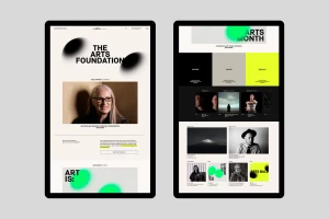
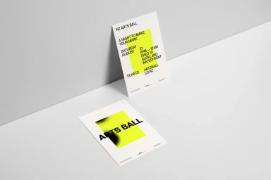
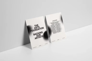
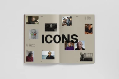
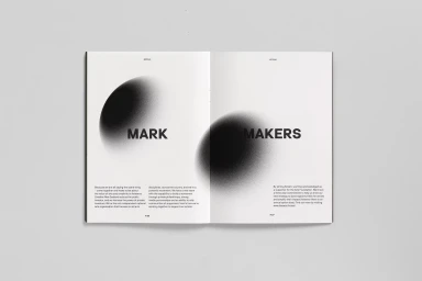
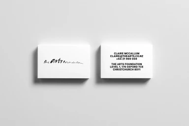
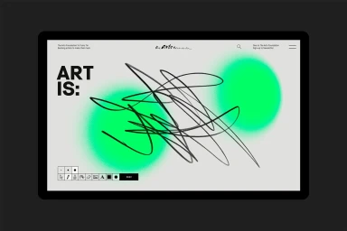
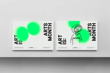
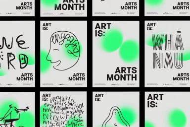
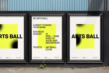
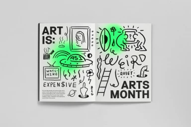
The brand identity project for the Arts Foundation, executed by McCarthy, offers a masterclass in balancing institutional authority with contemporary creative expression. Operating within the Digital Media and Publishers industry, the design system leans into editorial minimalism, utilizing a sophisticated, high-contrast palette of black and white anchored by striking neon green and yellow accents. This project effectively bridges the gap between structured corporate identity and the raw, kinetic energy of the arts sector. The visual language relies heavily on a robust grid system, which seamlessly integrates clean sans-serif typography with playful, hand-drawn ink illustrations and soft-edged airbrushed gradients. Across various touchpoints—from digital web interfaces and UI illustrations to physical event posters and stationery—the design maintains a sharp, professional consistency while allowing for bursts of expressive abstraction. By combining disciplined negative space with experimental graphic flourishes, the branding creates a dynamic ecosystem that feels both accessible and authoritative. The result is a cohesive, forward-thinking visual identity that celebrates the diversity of local creative talent while grounding the Arts Foundation firmly in a modern, digital-first context. This approach elevates the organization’s presence, proving that institutional branding can be both highly functional and visually arresting through the strategic use of balanced layout, disciplined typography, and thoughtful, vibrant color interventions.
Horizontal, Commercial, Clean, Minimalist
Typography
