

metta
Featured metta projects
This week's top metta projects, carefully handpicked by Visie's expert curators, showcase the best in style and innovation.
 Project
 metta · Brand Identity
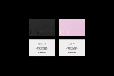
This brand identity project for Metta establishes a versatile visual language across corporate and commercial touchpoints. Developed by Ensemble, the system leans into a minimalist aesthetic, utilizing a restrained serif typeface and a palette that balances stark black and white contrasts with vibrant, abstract gradient fields. The execution spans physical and digital collateral, from textured business card stock featuring emboss and deboss details to cohesive mobile UI layouts. The visual strategy integrates industrial imagery with geometric architectural patterns, creating a cohesive narrative through clean typography and intentional negative space. Documentation includes comprehensive presentation decks that showcase the brand’s typographic hierarchies, diagrammatic frameworks, and product packaging, highlighting a scalable approach to professional design systems.
 Project
 metta · Brand Identity
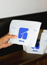
The brand identity for Metta, developed by &why, establishes a vibrant and modern visual system across print, digital, and outdoor media. The project centers on a playful use of kinetic typography, high-contrast color blocking, and geometric abstraction to define the brand's presence in the food and beverage sector. By combining bold, rounded lettering with clean vector-style illustrations, the identity moves between static editorial layouts and dynamic motion graphics. Execution across the identity suite ranges from documentary-style lifestyle imagery featuring branded apparel to studio-based commercial photography of artisanal baked goods. Throughout these applications—including packaging, outdoor signage, and digital animation—the design maintains a consistent aesthetic that leans into modular grids and minimalist layouts. This multi-channel approach highlights the versatility of the brand's visual language in both urban transit environments and tactile, editorial presentations.
Explore other brands
Explore Visie’s leading industries, projects, and the talented creatives representing them.





