
metta: Brand Identity
Oct 2021
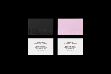
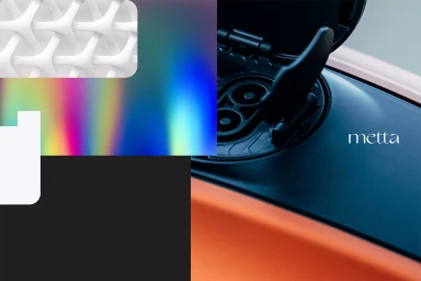
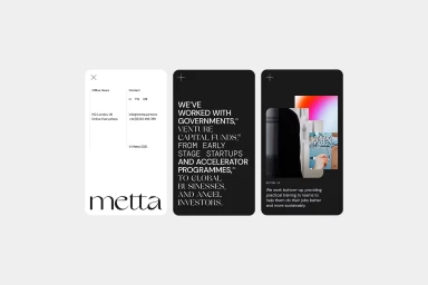
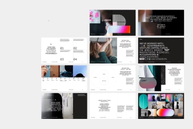
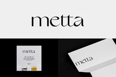
This brand identity project for Metta establishes a versatile visual language across corporate and commercial touchpoints. Developed by Ensemble, the system leans into a minimalist aesthetic, utilizing a restrained serif typeface and a palette that balances stark black and white contrasts with vibrant, abstract gradient fields. The execution spans physical and digital collateral, from textured business card stock featuring emboss and deboss details to cohesive mobile UI layouts. The visual strategy integrates industrial imagery with geometric architectural patterns, creating a cohesive narrative through clean typography and intentional negative space. Documentation includes comprehensive presentation decks that showcase the brand’s typographic hierarchies, diagrammatic frameworks, and product packaging, highlighting a scalable approach to professional design systems.
Horizontal, Commercial, Clean, Minimalist
Typography
