
metta: Brand Identity



May 2024
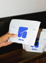
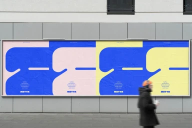
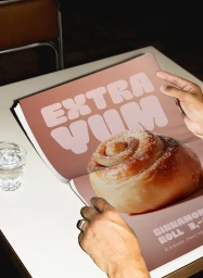
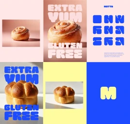
The brand identity for Metta, developed by &why, establishes a vibrant and modern visual system across print, digital, and outdoor media. The project centers on a playful use of kinetic typography, high-contrast color blocking, and geometric abstraction to define the brand's presence in the food and beverage sector. By combining bold, rounded lettering with clean vector-style illustrations, the identity moves between static editorial layouts and dynamic motion graphics. Execution across the identity suite ranges from documentary-style lifestyle imagery featuring branded apparel to studio-based commercial photography of artisanal baked goods. Throughout these applications—including packaging, outdoor signage, and digital animation—the design maintains a consistent aesthetic that leans into modular grids and minimalist layouts. This multi-channel approach highlights the versatility of the brand's visual language in both urban transit environments and tactile, editorial presentations.
Commercial, Clean
