

Happy Endings
Featured Happy Endings projects
This week's top Happy Endings projects, carefully handpicked by Visie's expert curators, showcase the best in style and innovation.
Happy Endings · Brand Identity
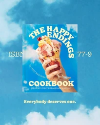
Happy Endings unveils a comprehensive brand identity system, executed by graphic design studio Land of Plenty. The project establishes a vibrant visual language for the frozen dessert brand, utilizing high-contrast color palettes and playful, bold typography that carries across digital and physical touchpoints. The execution leans into a clean, graphic aesthetic, bridging the gap between product packaging and digital UI design. Motion graphics and animation techniques bring the brand’s typographic assets to life, featuring fluid transitions and responsive layouts. From studio photography capturing tactile dessert textures to environmental shots set against bright, saturated backdrops, the work emphasizes a cohesive design system defined by its energetic and contemporary visual tone.
 Project
 Happy Endings · Brand Identity
Happy Endings focuses on a comprehensive brand identity project that blends playful aesthetics with structured commercial design. The visual identity incorporates a vibrant color palette, using saturated tones and bold typography to create a cohesive look across cookbook covers, packaging, and signage. The design work balances a whimsical, youth-oriented atmosphere with clean, minimalist layouts suitable for diverse applications. Artistic and editorial techniques are employed throughout the identity to ensure the brand remains visually distinct across both digital and physical mediums. Graphic design contributions for this project come from Land of Plenty, Monday Nights, TRiC, Gemma Mahoney, and Fiasco Design.
Explore other brands
Explore Visie’s leading industries, projects, and the talented creatives representing them.





