
Happy Endings: Brand Identity
Jun 2024
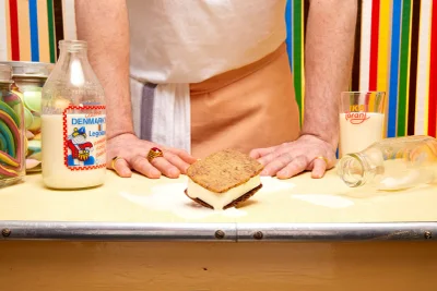
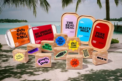
Happy Endings unveils a comprehensive brand identity system, executed by graphic design studio Land of Plenty. The project establishes a vibrant visual language for the frozen dessert brand, utilizing high-contrast color palettes and playful, bold typography that carries across digital and physical touchpoints. The execution leans into a clean, graphic aesthetic, bridging the gap between product packaging and digital UI design. Motion graphics and animation techniques bring the brand’s typographic assets to life, featuring fluid transitions and responsive layouts. From studio photography capturing tactile dessert textures to environmental shots set against bright, saturated backdrops, the work emphasizes a cohesive design system defined by its energetic and contemporary visual tone.
Commercial, Horizontal, Graphic
Advertising Campaign
