

Antalis
Featured Antalis projects
This week's top Antalis projects, carefully handpicked by Visie's expert curators, showcase the best in style and innovation.
 Project
 Antalis · Brand Identity
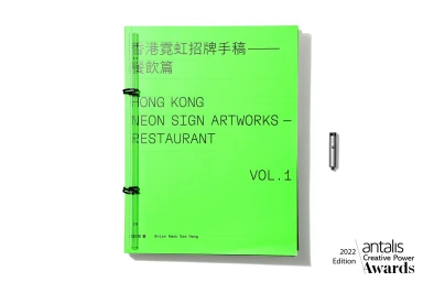
Antalis showcases its material range through a comprehensive brand identity project that emphasizes tactile paper craftsmanship. The collection of publications utilizes various high-end production techniques, including screen printing, embossing, and debossing, to demonstrate the structural potential of different paper stocks. Featuring editorial design and commercial print applications, the work centers on minimalist aesthetics and clean typography. The project integrates artistic photography, desaturated imagery, and experimental layouts, reflecting a commitment to premium print finishing and material detail.
 Project
 Antalis · Brand Identity
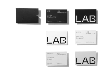
This brand identity project for Antalis explores tactile print design and corporate stationery systems through a series of structured compositions. The collateral features a mix of monochrome and muted palettes, utilizing clean typography and graphic layouts to showcase various paper stocks and textures. The project highlights a diverse array of print techniques, including emboss and deboss detailing, screen printing, and minimalist layouts. Through precise arrangements, the work emphasizes paper quality and the formal interplay between typography and negative space.
 Project
 Antalis · Brand Identity
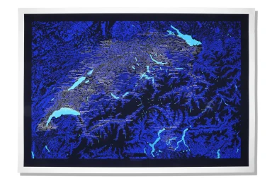
Antalis explores corporate brand identity through a series of commercial print collateral and stationery assets. The project focuses on tactile paper applications, utilizing minimalist design and precise typography to establish a professional visual language. Execution across the collection leans into graphic collage techniques, pairing photographic elements with handwritten scripts and high-contrast, digital illustration. Technical details like emboss and deboss finishes are applied to notebook covers, while topographical maps demonstrate the brand's versatility in layout and composition.
 Project
 Antalis · Brand Identity
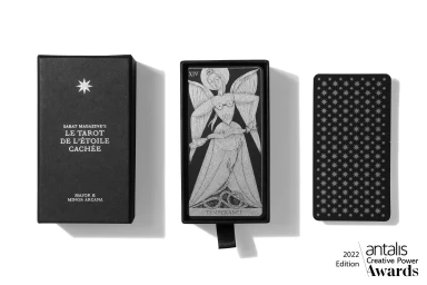
The Antalis brand identity project centres on a series of premium print assets and packaging designs that showcase tactile material experimentation. The collection integrates a mix of rigid matte boxes featuring silver foil detailing with printed brochures and panels, leaning into minimalist typography and high-contrast visuals to define the brand aesthetic. Execution focuses on print production and graphic design, highlighting diverse surface treatments ranging from textured geological patterns to surreal, layered illustrations. The project makes extensive use of screen print techniques and tactile paper stocks, maintaining a clean, studio-lit presentation that emphasizes both functional typography and artistic composition across the portfolio.
 Project
 Antalis · Brand Identity
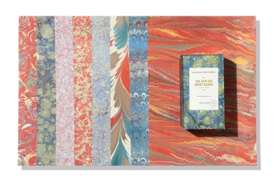
Antalis showcases its specialty paper stock through a comprehensive brand identity project. The work focuses on the tactile properties of various paper materials, utilizing complex marbled patterns and textured grey cardboard to form structural packaging designs. Featuring minimalist typography and custom graphic panels, the project utilizes clean compositions to highlight the material quality of the paper. This commercial branding initiative emphasizes high-contrast visual elements and structural paper engineering.
 Project
 Antalis · Brand Identity
Antalis presents a comprehensive brand identity project centered on clean, minimalist packaging design. The work explores the intersection of form and utility through a series of white and brown cardboard structural designs, utilizing natural light to accentuate clean lines and geometric layouts. The collection features intricate typography and graphic illustrations, including detailed profile diagrams and mathematical notations. By balancing structural paper materials with delicate branded wraps, the project highlights corporate aesthetics and sustainable packaging principles.
 Project
 Antalis · Brand Identity
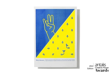
The Antalis brand identity project manifests as a series of graphic posters and conceptual development materials, centering on bold typographic expression and minimalist illustration. The work utilizes a striking blue and yellow palette to form a cohesive visual language, incorporating vector-based iconography and clean screen print aesthetics to communicate its themes. The development process is documented through extensive research, featuring editorial-style notebook spreads. These archives layer historical photographs, collage elements, and hand-drawn conceptual maps, grounding the finished graphic identity in a rigorous exploration of historical and thematic associations.
 Project
 Antalis · Brand Identity
This brand identity project for Antalis focuses on tactile paper-based collateral and sophisticated packaging design. The work explores material quality through layered cardstock, intricate geometric cutouts, and specialized finishing techniques like emboss and deboss. Utilizing a minimalist aesthetic, the project features a range of functional presentation folders and modular boxes. The execution integrates fine typography and botanical graphics, often finished with delicate ribbon closures and torn edge detailing. The overall presentation prioritizes clean lines and high-end paper craft to showcase brand materials.
 Project
 Antalis · Brand Identity
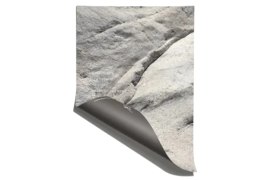
The Antalis Brand Identity project showcases a comprehensive suite of commercial stationery, packaging design, and editorial collateral. The body of work leans into tactile paper surfaces, utilizing natural light and clean minimalist compositions to emphasize material quality. Featured elements range from debossed stationery sets and translucent vellum inserts to complex, multi-textured product cartons featuring precise anatomical line art and graphic illustrations. Techniques such as screen printing and embossing define the series, while a focus on typography creates a cohesive visual system across diverse applications. From minimalist thread box packaging to artistically rendered graphic posters, the project highlights versatility in design through consistent use of texture, grain, and high-contrast layouts.
 Project
 Antalis · Brand Identity
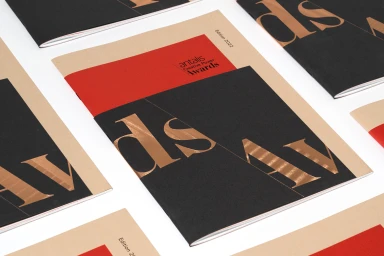
The Antalis brand identity project, designed by Design & Practice, centers on a sophisticated editorial and print system that showcases the company's paper collections. The work leverages a minimal, clean aesthetic, utilizing a restrained palette of tan, black, and vibrant red to ground the layout. By incorporating tactile elements and high-end print finishes, the design highlights the premium nature of the paper substrates, including Curious Collection and Olin stocks. Technically, the project emphasizes materiality through macro photography, metallic foil stamping, and emboss and deboss details. The graphic design language relies on precise typography and geometric layouts that bridge the gap between commercial product catalogs and editorial design, demonstrating the physical possibilities of paper in professional branding.
Explore other brands
Explore Visie’s leading industries, projects, and the talented creatives representing them.





