
Antalis: Brand Identity
Brand
Date
Aug 2022
Description
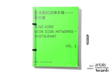
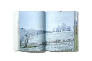
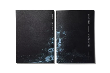
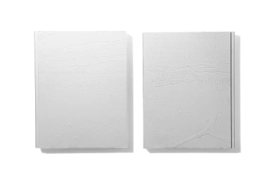
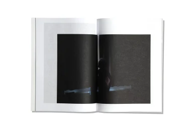
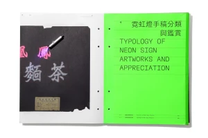
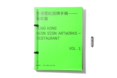
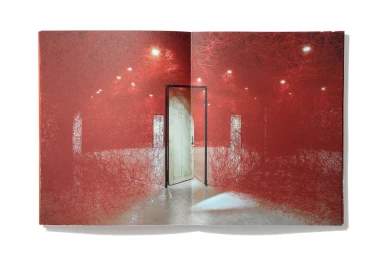
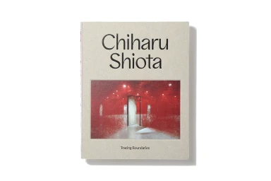
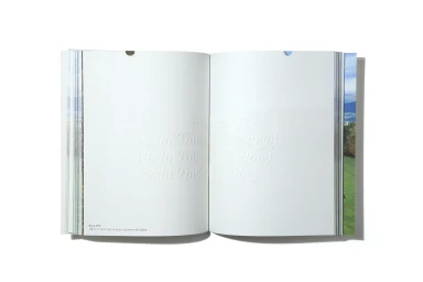
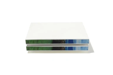
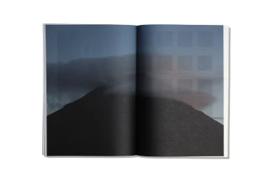
Antalis showcases its material range through a comprehensive brand identity project that emphasizes tactile paper craftsmanship. The collection of publications utilizes various high-end production techniques, including screen printing, embossing, and debossing, to demonstrate the structural potential of different paper stocks. Featuring editorial design and commercial print applications, the work centers on minimalist aesthetics and clean typography. The project integrates artistic photography, desaturated imagery, and experimental layouts, reflecting a commitment to premium print finishing and material detail.
Style
Clean, Minimalist, Horizontal, Commercial
Color
Pure White
Background
White Seamless
Associated creatives

5000+ creatives to discover
Sign up to gain access to the entire directory. It’s free.
Visie is a curated library of creative professionals.