

Amerikalinjen
Featured Amerikalinjen projects
This week's top Amerikalinjen projects, carefully handpicked by Visie's expert curators, showcase the best in style and innovation.
 Project
 Amerikalinjen · Brand Identity
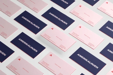
The brand identity for Amerikalinjen is a masterclass in modern, structured graphic design, seamlessly bridging the gap between historical architectural elegance and contemporary corporate utility. Spearheaded by Scandinavian Design Group, the project creates a cohesive visual language that feels both established and refreshingly forward-thinking. By utilizing a deliberate palette of deep navy blue, soft blush pink, and bold red, the identity employs rigorous typography—featuring high-quality typefaces from GT America and Grilli Type—to establish an immediate and recognizable brand presence. The work leans into a refined, minimalist aesthetic that translates effortlessly across diverse touchpoints, from tactile stationery and curated apparel collections to dynamic UI illustration and wayfinding systems. The execution demonstrates a sophisticated balance of hard light and geometric precision, often incorporating architectural line drawings that serve as a thematic anchor connecting the brand to its dual heritage between Oslo and New York. Through an organized, rhythmic use of 3D render and CGI elements, alongside clean vector icons, the identity feels both modular and deeply human. Whether displayed in architectural installations or through digital interfaces, the project showcases how disciplined corporate branding can maintain a playful, personality-driven spirit. It is an exploration of form and function that prioritizes clear visual hierarchy while ensuring every piece of the communication ecosystem remains distinct, functional, and aesthetically elevated for the modern traveler.
 Project
 Amerikalinjen · Brand Identity
The brand identity for Amerikalinjen serves as a masterclass in editorial minimalism, grounding the hospitality experience in a tactile and sophisticated visual language. Through a series of carefully composed flat-lay photography and clean graphic design, the project channels an aesthetic that balances historical weight with modern fluidity. The identity utilizes a distinctive palette—pairing muted, neutral greys and soft pastels with striking pops of vibrant red and teal—to create a sense of place that feels both curated and archival. As a commercial project, it excels in presenting high-end stationery and brand manuals that prioritize typography and negative space, reflecting the refined character of a boutique destination. Techniques such as emboss and deboss applications, coupled with high-key natural lighting, elevate the physical materiality of the brand collateral, making even a simple notebook feel like a premium keepsake. The editorial layout, punctuated by sharp sans-serif type and professional photography of contemporary interiors, demonstrates a cohesive vision for the brand. With expert graphic design work by Scandinavian Design Group, the project moves seamlessly between institutional history and the warmth of modern hospitality. By integrating lifestyle elements alongside structured corporate documentation, the identity establishes an atmosphere of understated elegance that is consistently reflected across every touchpoint, from room stationery to detailed architectural spreads.
Explore other brands
Explore Visie’s leading industries, projects, and the talented creatives representing them.





