

Waka Waka
Featured Waka Waka projects
This week's top Waka Waka projects, carefully handpicked by Visie's expert curators, showcase the best in style and innovation.
 Project
 Waka Waka · Brand Identity
Waka Waka elevates its presence through a cohesive brand identity that functions as a masterclass in editorial minimalism and structural clarity. Centered on the work of designer Shin Okuda, this comprehensive design project bridges the gap between hand-crafted wood furniture and high-concept graphic representation. The execution leans into a rigorous, monochromatic palette, where high-contrast black and white photography interacts seamlessly with bold sans-serif typography. By adopting a Swiss-inspired layout, the brand identity effectively utilizes negative space to draw focus toward the industrial geometry of the Cylinder Back Chair and Metal Lounge collections. The visual language is intentionally stark and professional, mirroring the functionality of the studio's output. Throughout the various touchpoints—ranging from UI illustration and mobile interface design to print posters and apparel—the project maintains a consistent corporate tone that feels both academic and deeply artistic. With graphic design input from Ben Mingo, the collaboration captures the intersection of utilitarian design and modern graphic storytelling. The integration of soft lighting and clean, architectural compositions serves to highlight the granular textures of the furniture while reinforcing the studio's Los Angeles roots. Ultimately, this body of work acts as a visual manifesto, transforming product documentation into a curated brand experience that prioritizes legibility, form, and a refined, timeless aesthetic.
 Project
 Waka Waka · Brand Identity
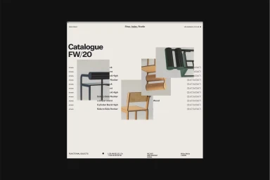
The brand identity for Waka Waka, developed by MOUTHWASH Studio, is an exercise in restraint that perfectly mirrors the sculptural, modernist ethos of designer Shin Okuda. By prioritizing bold, sans-serif typography and a monochromatic palette, the project establishes a high-end, contemporary digital catalog experience that allows the furniture itself to command center stage. The identity leans heavily into a minimalist design aesthetic, utilizing a structured grid system across both tablet and mobile interfaces to ensure that every geometric frame and tubular steel detail is presented with maximum clarity. Web development by Aristide Benoist further elevates this corporate and commercial identity, creating a seamless user journey that feels both intentional and highly professional. Throughout the assets, the use of UI illustration and crisp natural light photography reinforces a cohesive visual language where form follows function. The inclusion of a stark, radiating line-art emblem serves as a graphic anchor, grounding the collection in a deliberate, artistic tradition that spans from Los Angeles studios to the digital sphere. By stripping away visual noise, the brand identity manages to highlight the craftsmanship of wood furniture while maintaining an atmosphere of refined precision. The resulting work is not merely a showcase of product, but a rigorous, cinematic exploration of the brand's core identity, capturing the subtle interplay between architectural geometry and functional design.
 Project
 Waka Waka · Brand Identity
The brand identity for Waka Waka represents a masterful exercise in restraint, where the functional, sculptural woodwork of founder Shin Okuda finds its perfect digital and physical counterpart. Orchestrated by the team at Mouthwash Studio, the identity leans into a strictly minimalist aesthetic that prioritizes clarity and geometric precision. By utilizing a sophisticated grid-based layout and bold, sans-serif typography, the design acts as an architectural frame for the furniture rather than a distraction from it. The visual language across the digital catalogue and product interfaces emphasizes a monochromatic palette, allowing the unique, cylindrical silhouettes of the chairs to serve as the primary focus. With technical execution handled by web developer Tim Roussilhe, the resulting digital experience is seamless and highly structured, mirroring the studio's own commitment to professional, high-end craftsmanship. This corporate design approach extends beyond the screen, appearing in urban settings via crisp, billboard-mounted advertisements that juxtapose the studio’s organic wooden forms against sharp, brutalist architecture. Through clever use of negative space and consistent UI illustration techniques, the identity successfully translates the tactile, material-focused ethos of Waka Waka into a versatile toolkit that remains professional, functional, and deeply evocative of modern design excellence. It is a rare example of a brand system that feels entirely symbiotic with the products it represents, ensuring the design remains as enduring as the furniture itself.
Explore other brands
Explore Visie’s leading industries, projects, and the talented creatives representing them.





