
Waka Waka
Brand Identity
Apr 2020
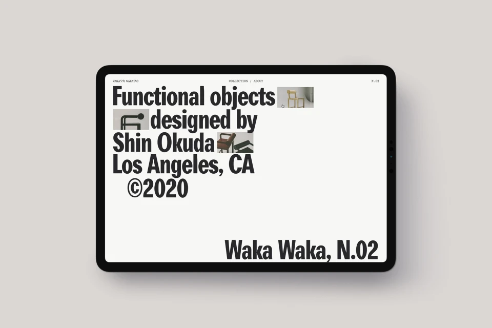
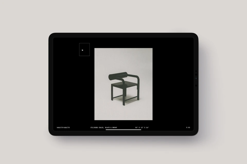
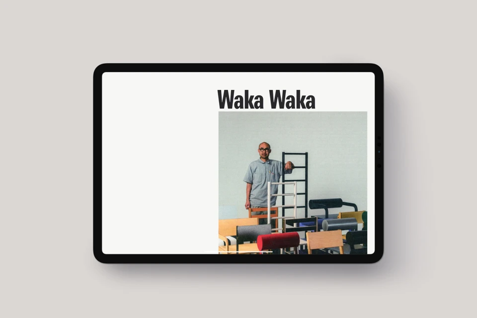
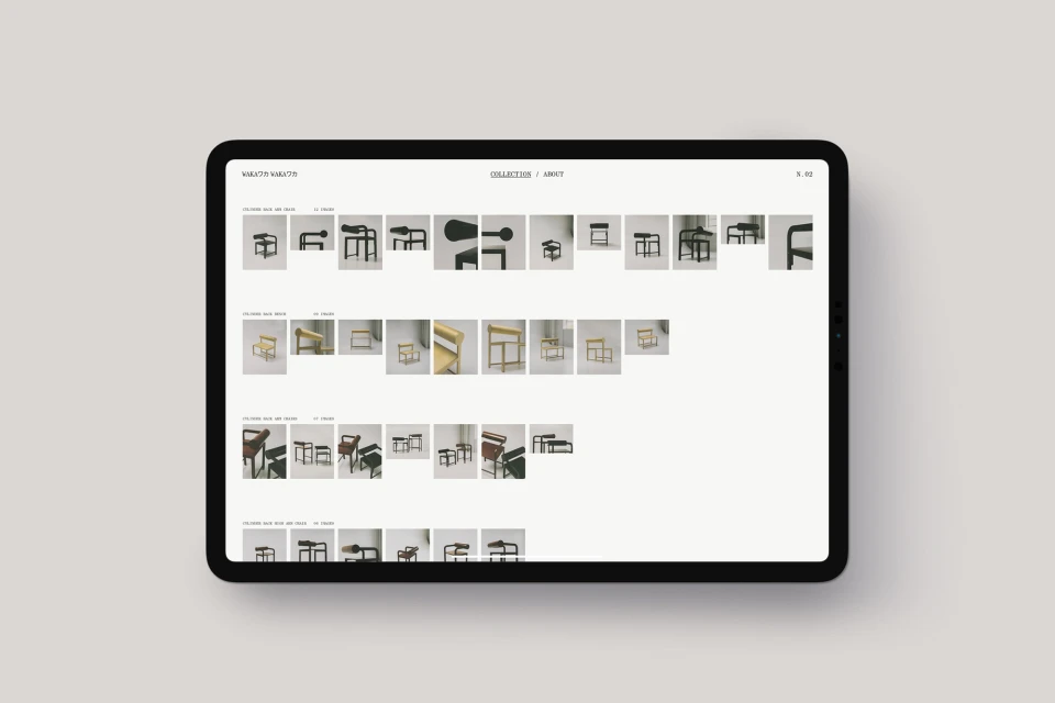
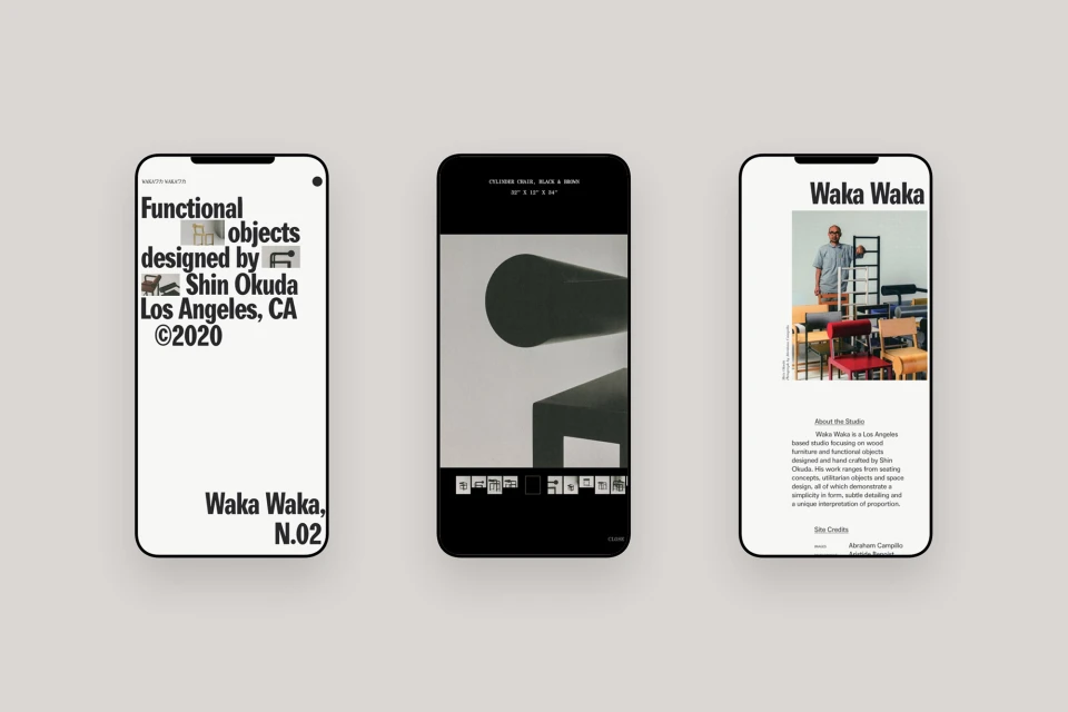
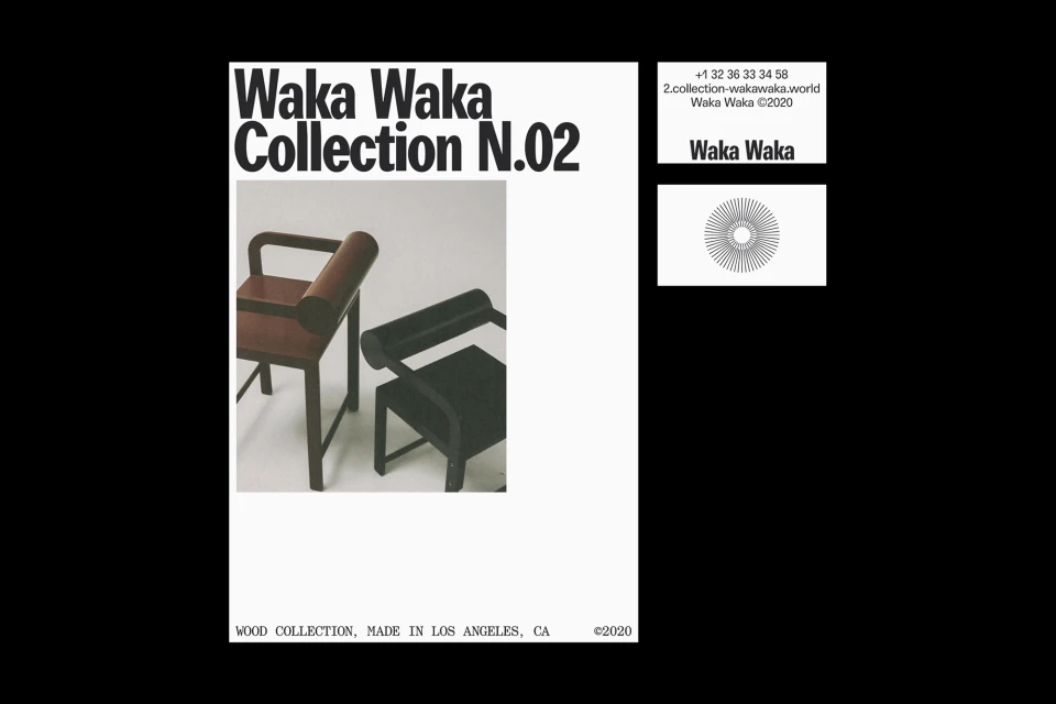
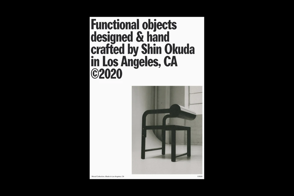
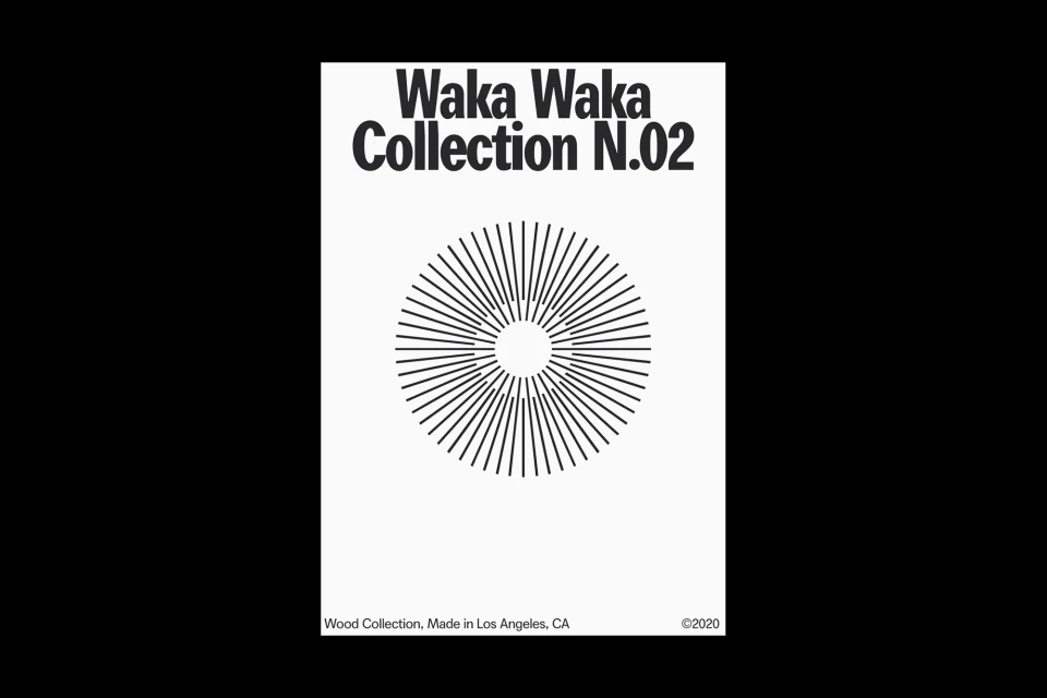
The brand identity for Waka Waka, developed by MOUTHWASH Studio, is an exercise in restraint that perfectly mirrors the sculptural, modernist ethos of designer Shin Okuda. By prioritizing bold, sans-serif typography and a monochromatic palette, the project establishes a high-end, contemporary digital catalog experience that allows the furniture itself to command center stage. The identity leans heavily into a minimalist design aesthetic, utilizing a structured grid system across both tablet and mobile interfaces to ensure that every geometric frame and tubular steel detail is presented with maximum clarity. Web development by Aristide Benoist further elevates this corporate and commercial identity, creating a seamless user journey that feels both intentional and highly professional. Throughout the assets, the use of UI illustration and crisp natural light photography reinforces a cohesive visual language where form follows function. The inclusion of a stark, radiating line-art emblem serves as a graphic anchor, grounding the collection in a deliberate, artistic tradition that spans from Los Angeles studios to the digital sphere. By stripping away visual noise, the brand identity manages to highlight the craftsmanship of wood furniture while maintaining an atmosphere of refined precision. The resulting work is not merely a showcase of product, but a rigorous, cinematic exploration of the brand's core identity, capturing the subtle interplay between architectural geometry and functional design.
Commercial, Clean, Minimalist, Horizontal
White Seamless

