
Waka Waka: Brand Identity
Sep 2020
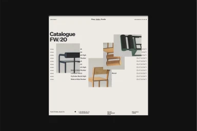
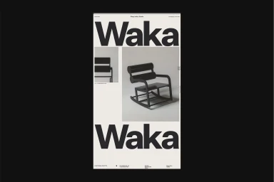
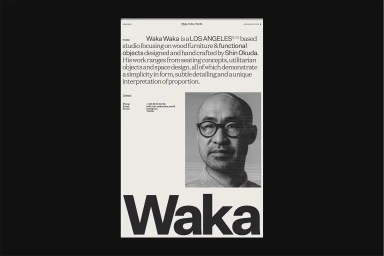
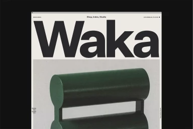
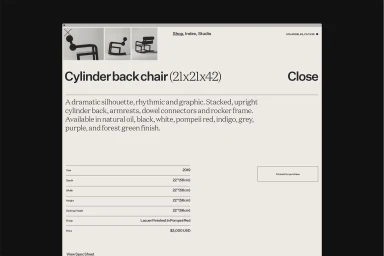
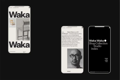
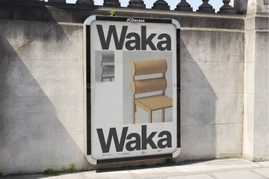
The brand identity for Waka Waka represents a masterful exercise in restraint, where the functional, sculptural woodwork of founder Shin Okuda finds its perfect digital and physical counterpart. Orchestrated by the team at Mouthwash Studio, the identity leans into a strictly minimalist aesthetic that prioritizes clarity and geometric precision. By utilizing a sophisticated grid-based layout and bold, sans-serif typography, the design acts as an architectural frame for the furniture rather than a distraction from it. The visual language across the digital catalogue and product interfaces emphasizes a monochromatic palette, allowing the unique, cylindrical silhouettes of the chairs to serve as the primary focus. With technical execution handled by web developer Tim Roussilhe, the resulting digital experience is seamless and highly structured, mirroring the studio's own commitment to professional, high-end craftsmanship. This corporate design approach extends beyond the screen, appearing in urban settings via crisp, billboard-mounted advertisements that juxtapose the studio’s organic wooden forms against sharp, brutalist architecture. Through clever use of negative space and consistent UI illustration techniques, the identity successfully translates the tactile, material-focused ethos of Waka Waka into a versatile toolkit that remains professional, functional, and deeply evocative of modern design excellence. It is a rare example of a brand system that feels entirely symbiotic with the products it represents, ensuring the design remains as enduring as the furniture itself.
Commercial, Clean, Minimalist, Vertical
Typography
Website / Web

