
Whitney Houston: Brand Identity

Jan 2023
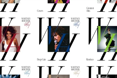
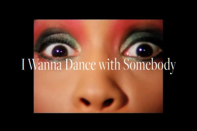
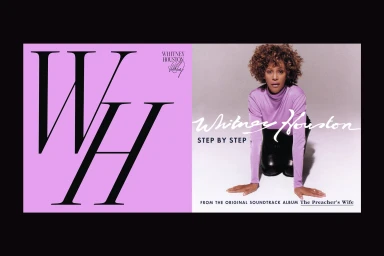
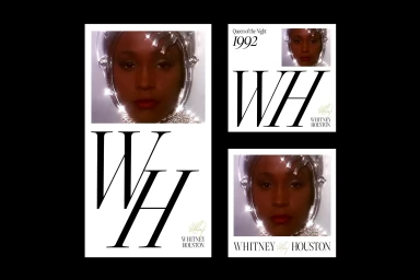
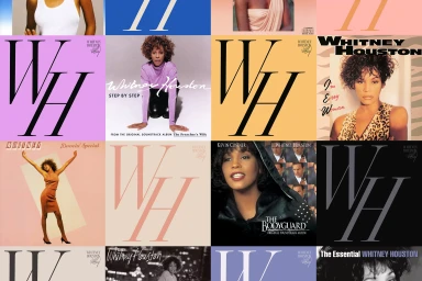
The Whitney Houston brand identity project establishes a visual language for the artist's discography and archival assets. Developed by Studio Herrström, Maya Gomez, and Tobias Raschbacher, the system utilizes high-contrast serif typography paired with archival portraiture to create a cohesive editorial presence. The design framework balances minimalist aesthetics with bold geometric elements, utilizing clean white backgrounds to highlight signature typography and monogram motifs. Techniques such as motion graphics and precise editorial layouts are applied across a range of media, from album covers to promotional portraits. By integrating custom letterforms with vibrant, multi-colored panels, the identity balances historical performance imagery with contemporary graphic design. The system emphasizes clear hierarchy and structured compositions, ensuring a consistent visual brand mark throughout the project's various applications.
Horizontal, Commercial, Clean, Graphic
Typography
White Seamless
Advertising Campaign


