
EMIR: Brand Identity
Dec 2019
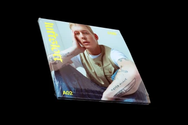
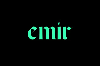
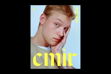
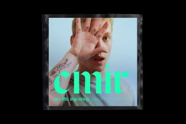
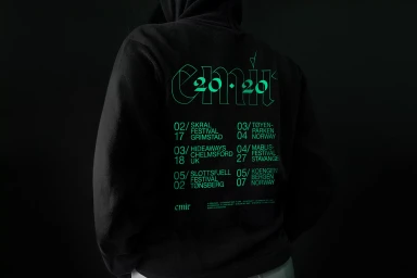
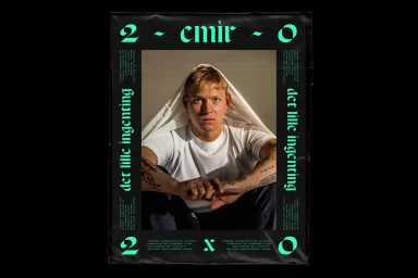
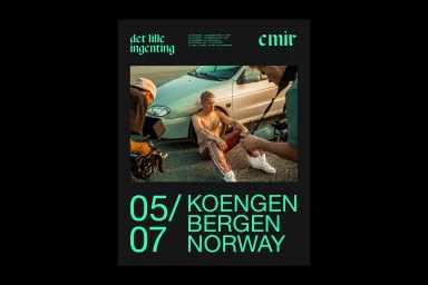
The brand identity project for EMIR acts as a masterclass in modern visual storytelling, seamlessly blending editorial sensibilities with raw, commercial edge. Spearheaded by the design team at Studio Herrström, the project defines the brand through a rigorous application of typography, utilizing both sharp, modern sans-serifs and stylized, glowing blackletter calligraphy to ground the identity in contemporary culture. The creative direction leans heavily into a high-contrast aesthetic, juxtaposing the deep, moody black-and-white portraiture against vibrant neon green and bold yellow graphic overlays. By integrating natural light photography with cinematic lighting techniques, the campaign captures a sense of lived-in authenticity that feels both personal and high-fashion. The execution balances intimate, textured portraiture featuring visible arm tattoos with clean, structured vector design, ensuring the brand mark remains both iconic and adaptable. Whether presented on shrink-wrapped album covers, minimalist posters, or tour merchandise featuring low-key chiaroscuro lighting, the project maintains a cohesive visual language that feels remarkably consistent. This brand identity project does not merely present a logo; it crafts a holistic world that thrives at the intersection of artistic expression and corporate design, proving that thoughtful, intentional typography can define the pulse of a brand while simultaneously serving as a bridge between the subject and the audience.
Artistic, Vertical, Clean, Graphic
Typography
Advertising Campaign
