
Wasted Paris: Brand Identity



Dec 2019
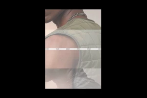
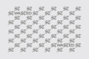
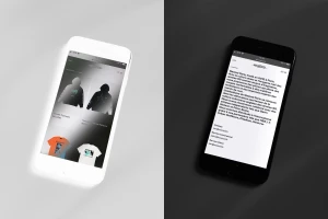
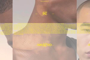
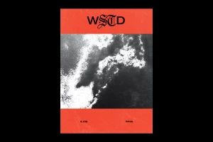
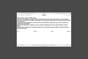
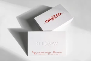
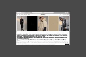
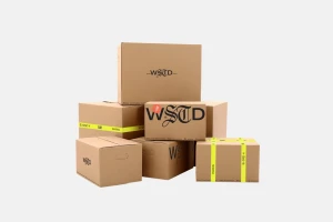
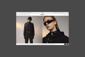
Wasted Paris has long been a fixture of the contemporary streetwear scene, and this comprehensive brand identity project crystallizes the label's ethos into a sharp, cohesive visual language. Through the expert lens of the creative team at Plus Mûrs, the brand leans into an aesthetic that feels both post-apocalyptic and inherently rooted in the raw energy of 90s skate culture. The execution balances high-contrast, minimalist design with a gritty, lo-fi sensibility, effectively bridging the gap between archival indie imagery and modern luxury. Across various touchpoints, including digital UI illustrations, editorial photography, and tactile stationery featuring sophisticated emboss and deboss techniques, the project maintains a rigorous, grid-like structure that anchors the brand's diverse inspirations. Typography plays a pivotal role, with the juxtaposition of clean, geometric sans-serif lettering against ornate, gothic-inspired logotypes defining the WSTD identity. This interplay extends from the packaging, where utilitarian corrugated boxes meet neon yellow industrial branding, to the digital storefront, which prioritizes a seamless, text-heavy editorial experience. By weaving together technical fabrications like rip-stop nylon and holo-reflective surfaces with this stark, monochromatic graphic system, the project delivers a refined, industrial-facing brand identity that feels both established and daringly experimental. It is a masterclass in modern fashion branding, demonstrating how to retain a rebellious streetwear spirit within a polished, corporate-ready framework.
Clean, Horizontal, Minimalist, Commercial
Typography
