
5PM: Brand Identity
Aug 2019
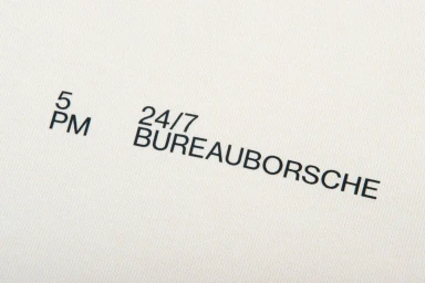
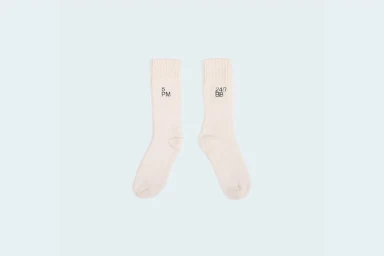
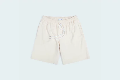
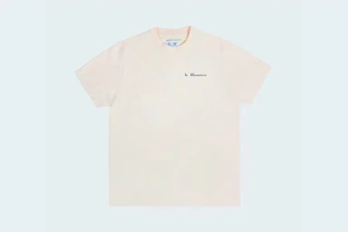
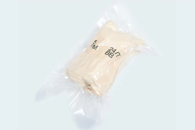
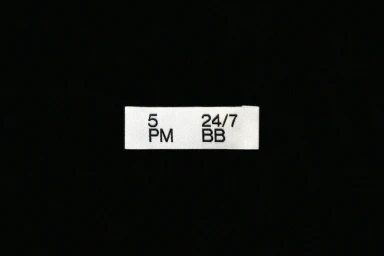
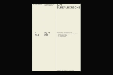
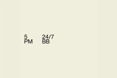
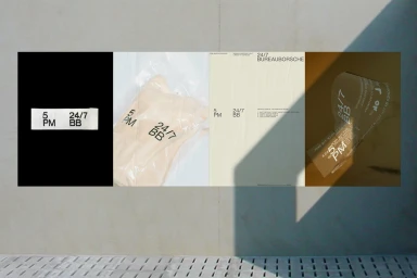
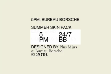
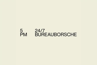
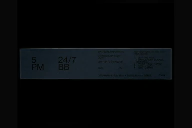
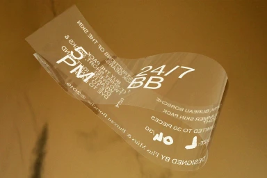
The brand identity for 5PM, developed in collaboration with Plus Mûrs and Bureau Borsche, stands as a masterclass in modern, minimalist design. By stripping away extraneous noise, the project leans into a highly graphic and utilitarian aesthetic that prioritizes structural clarity and typographic precision. Across a range of assets, the visual language utilizes a stark, high-contrast palette of black, off-white, and neutral cream tones to ground the work in a contemporary commercial context. The design effectively channels a clean, industrial sensibility through the strategic use of negative space, vector layouts, and tactile material applications, such as vacuum-sealed packaging and matte fabric textures. Whether presented as flat-lay product photography with soft light or as technical, grid-based graphic design, the collaboration remains consistent in its pursuit of professional, intentional form. The interplay between the sans-serif typography and the structured, deliberate alignments reinforces a sense of corporate sophistication, ensuring that even the most functional elements—like informational labels and clothing tags—become part of a cohesive brand story. This identity project is defined by its restraint, proving that when typography and space are handled with this level of rigor, the result is a timeless and authoritative visual signature that communicates the 5PM ethos with absolute, unfiltered clarity.
Horizontal, Commercial, Clean, Minimalist
Typography
Advertising Campaign

