
OURROS: Brand Identity
Feb 2021
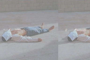
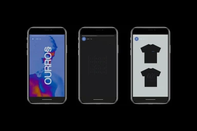
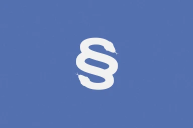
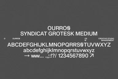
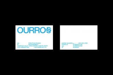
The brand identity for OURROS, developed by Plus Mûrs, centers on a minimalist visual language that balances clean graphic forms with tactile texture. The project encompasses a comprehensive design system, featuring a custom Syndicat Grotesk Medium typeface and a stylized serpent emblem that utilizes vector-style iconography. Across both static and motion applications, the identity leans into a clean, commercial aesthetic. Editorial photography incorporating analogue film and natural light provides a desaturated contrast to the sharp, digital precision of the brand's UI illustrations and 3D render animations. The system extends to physical assets, where embossing techniques on print collateral highlight a focus on material depth. This cohesive identity is anchored by a consistent use of bold typography and a restricted color palette, ensuring a distinct, structured presence across all brand touchpoints.
Horizontal, Commercial, Clean, Minimalist
Advertising Campaign
