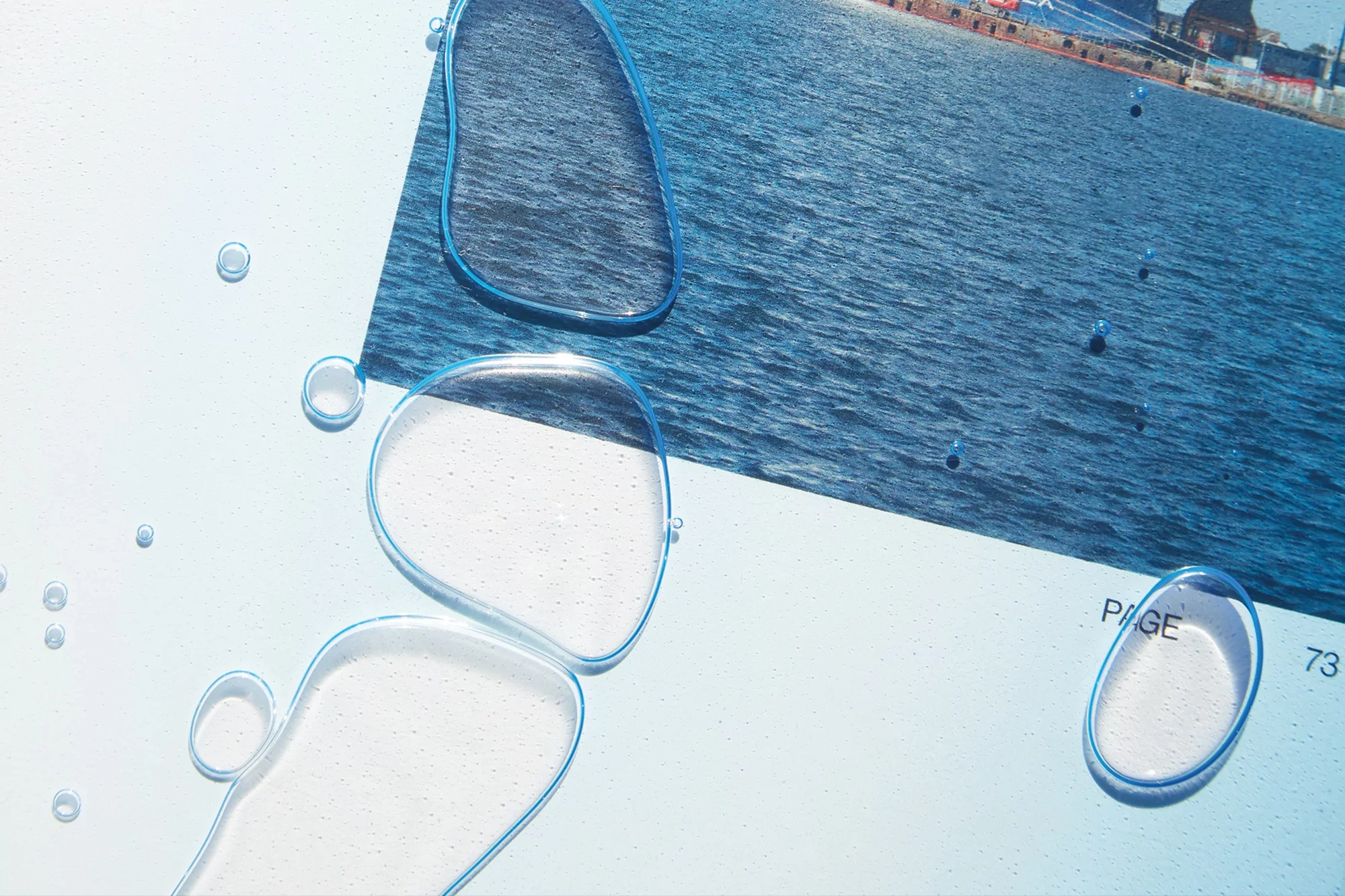
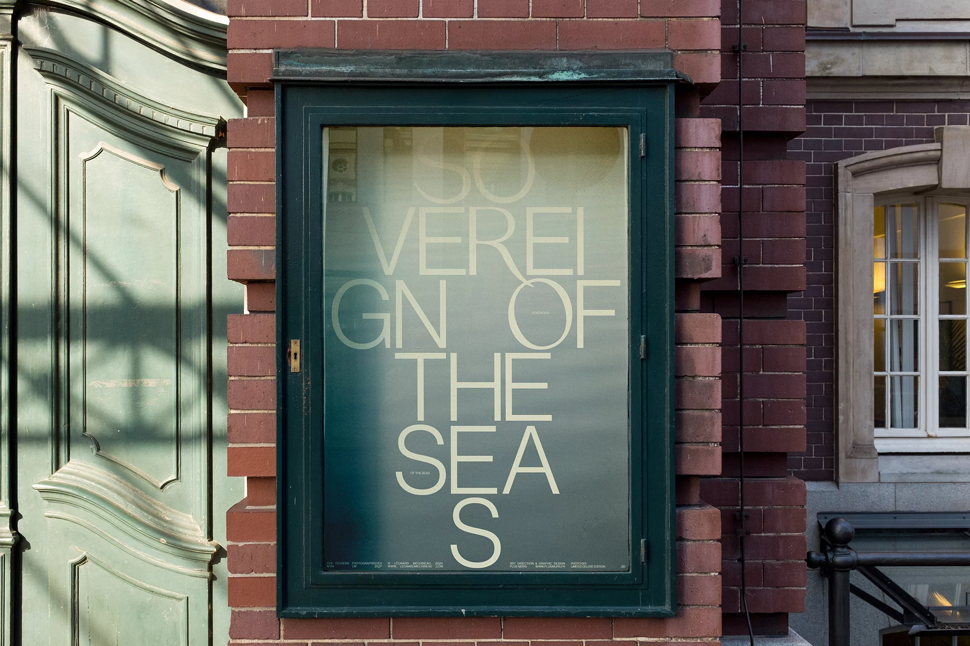
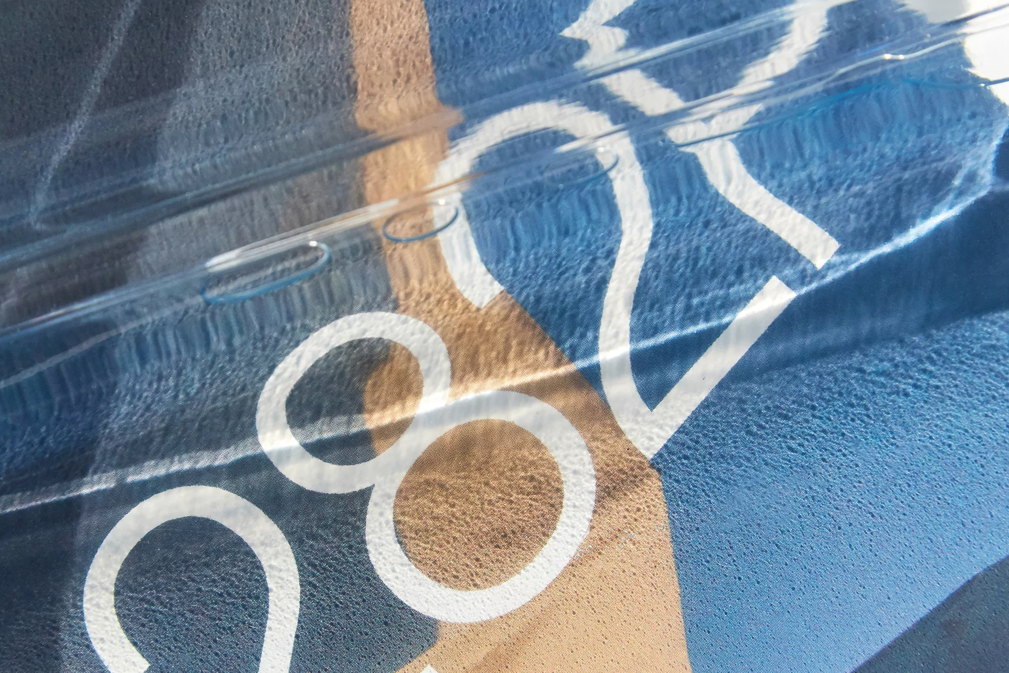
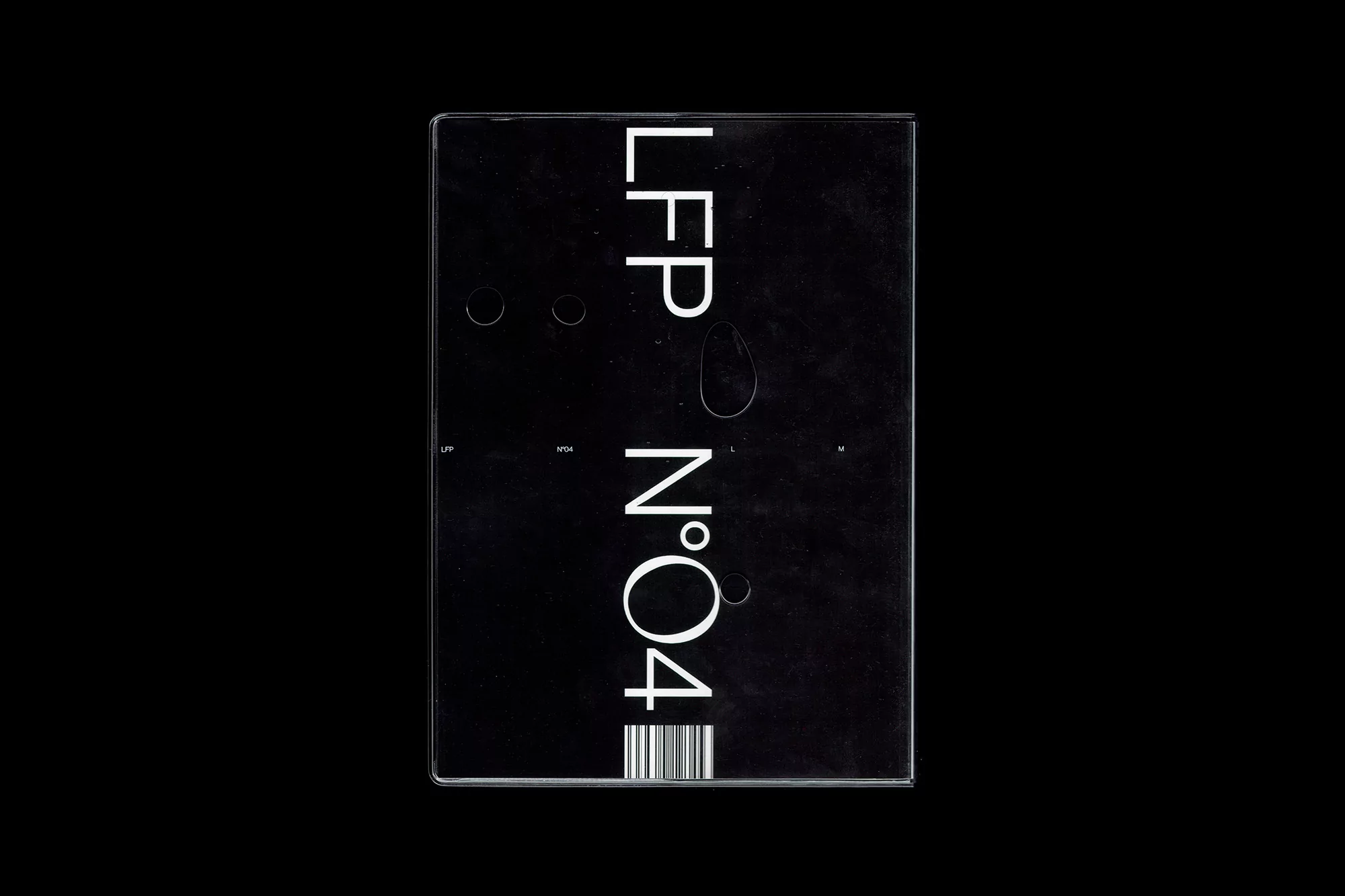
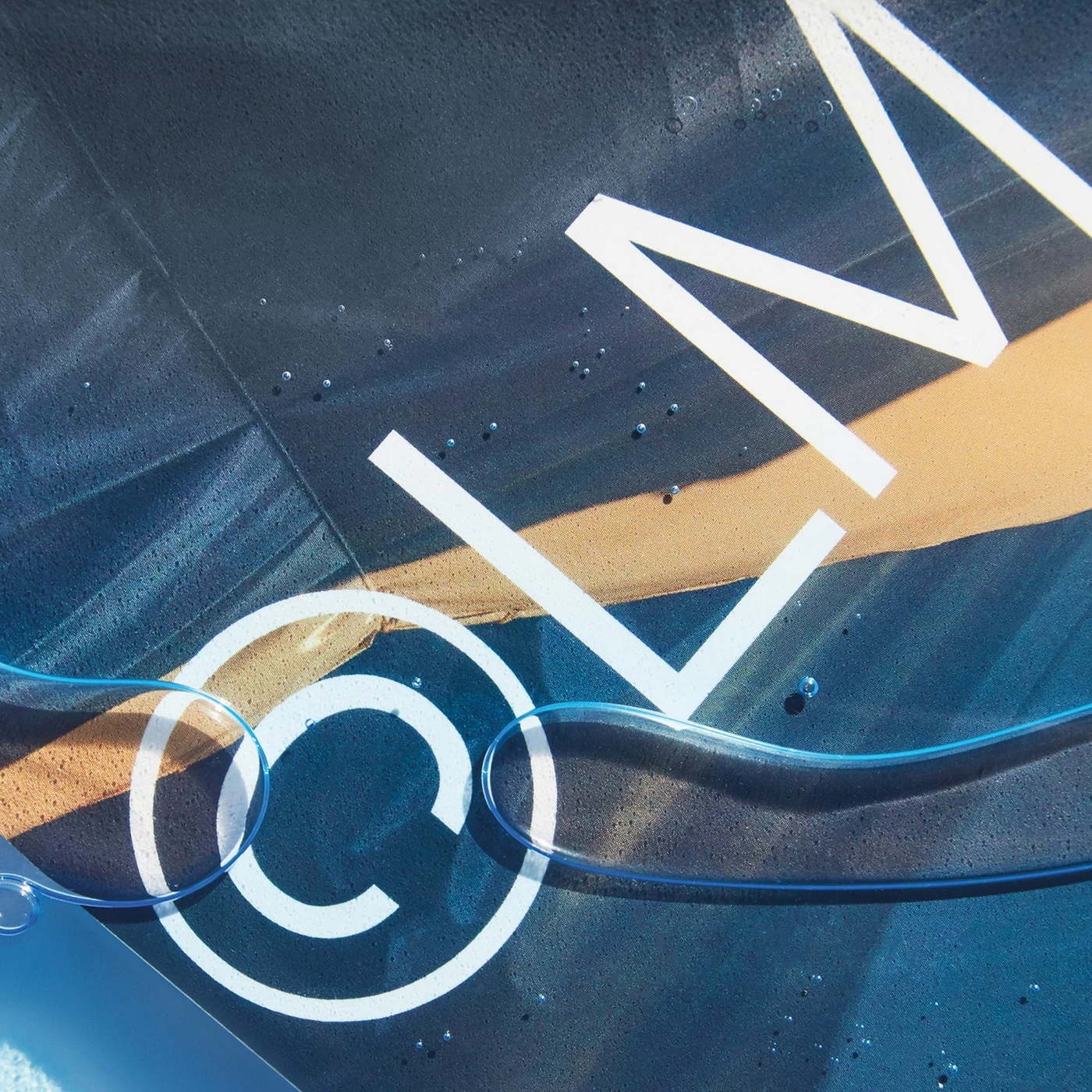
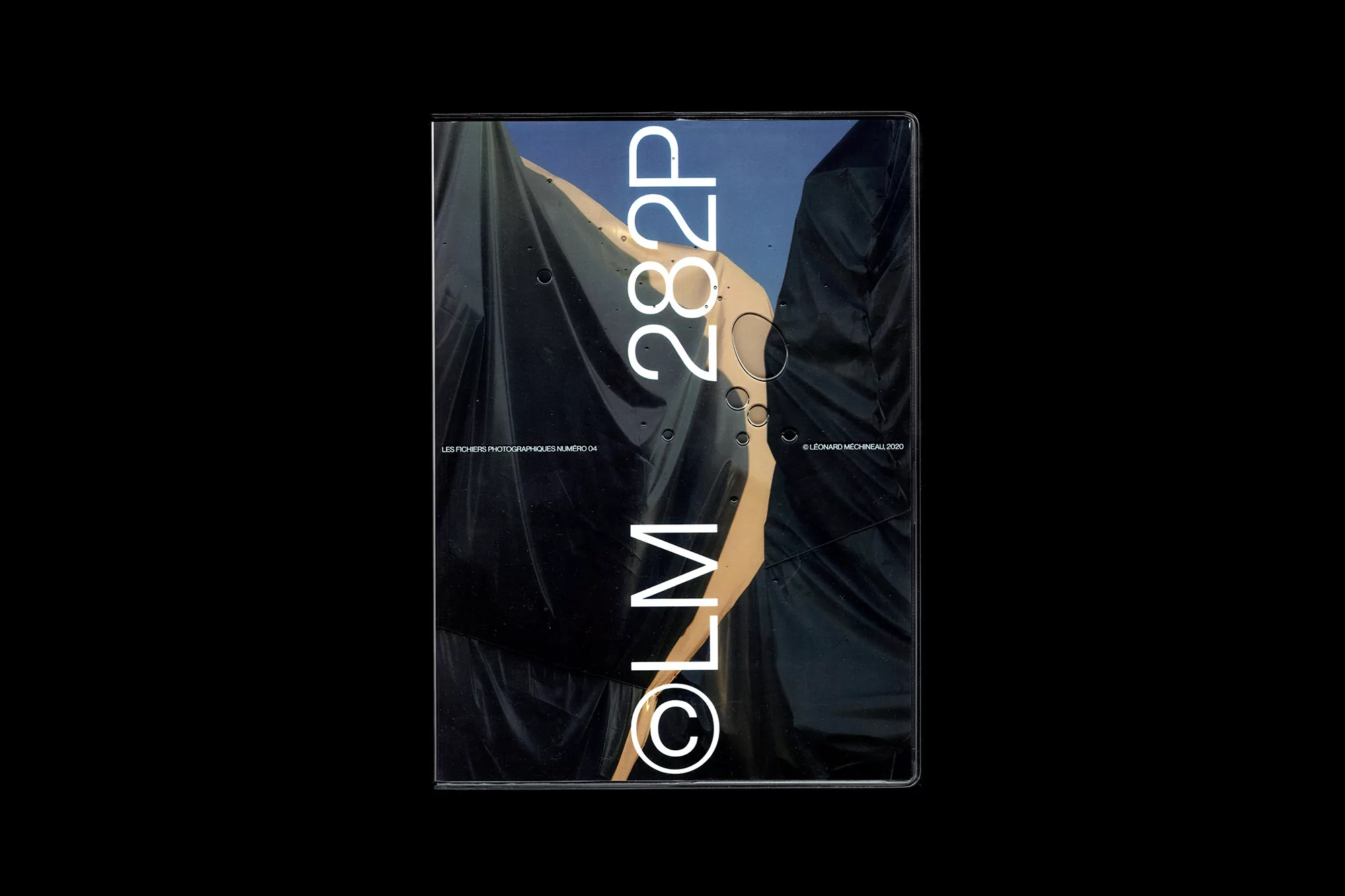
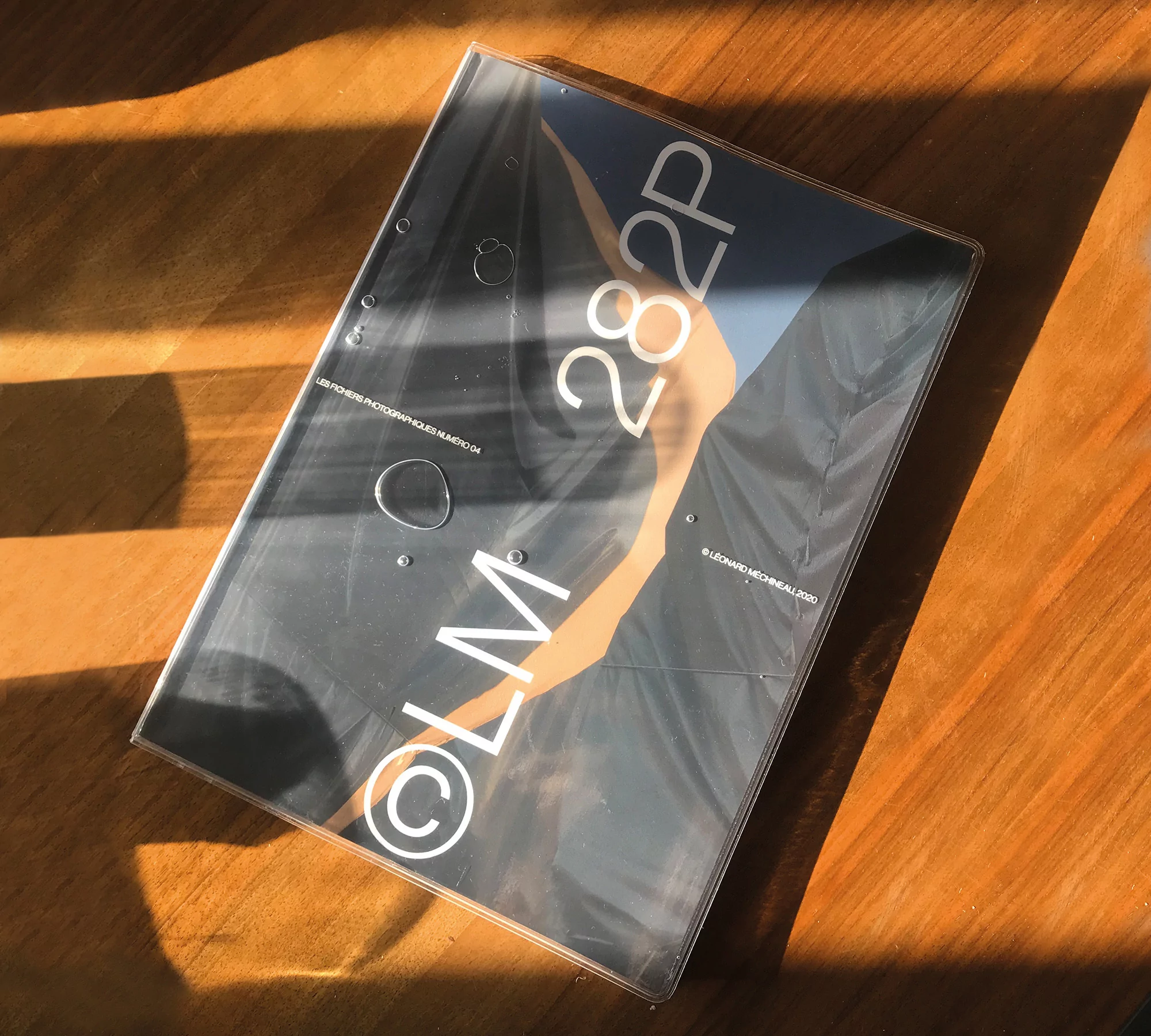
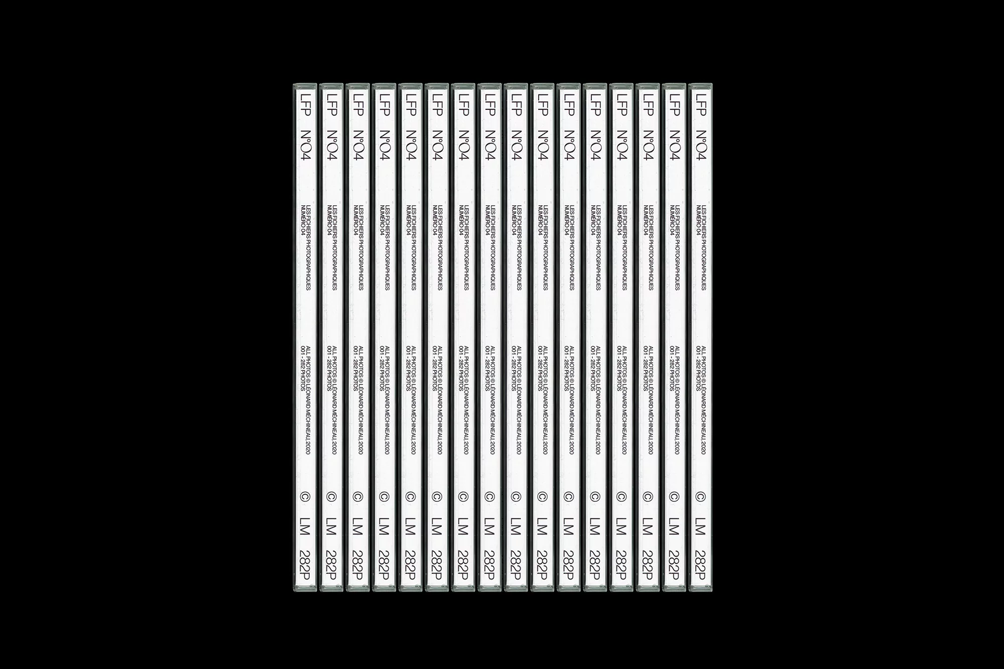
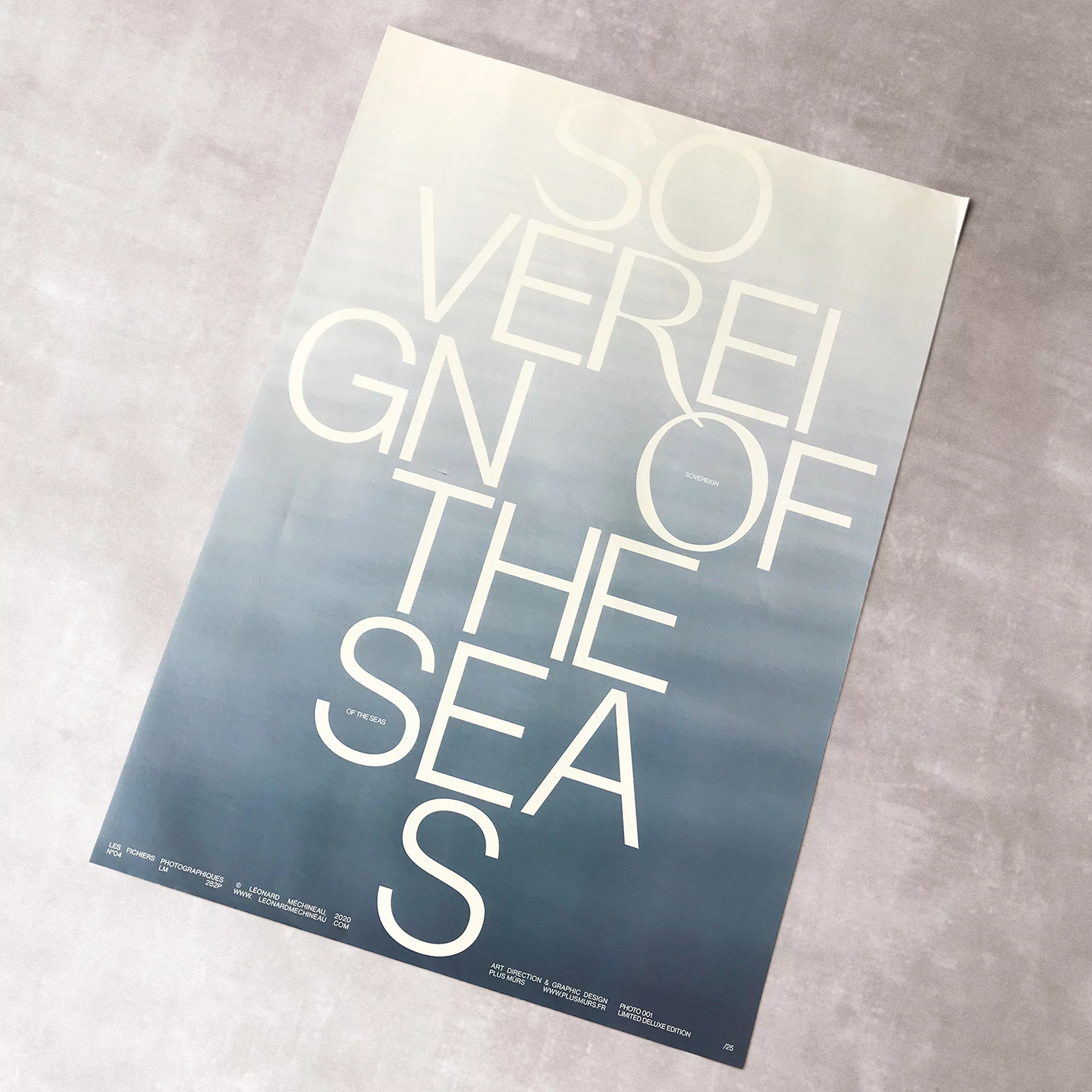
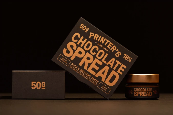
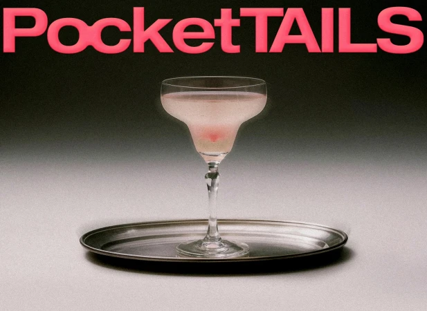
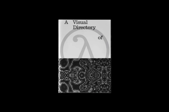
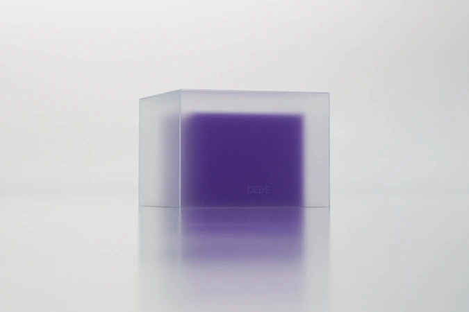
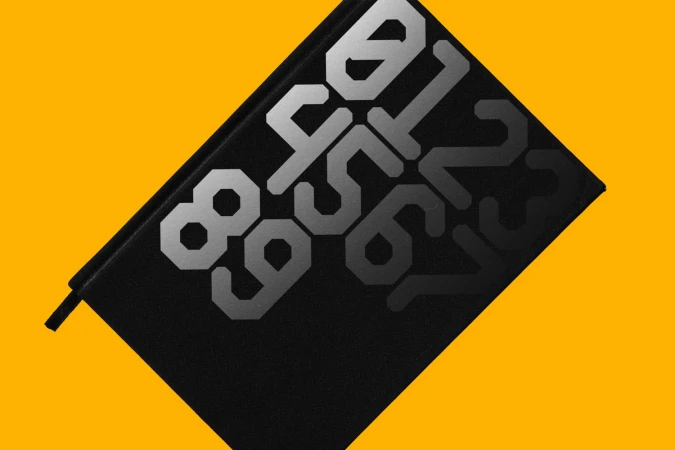
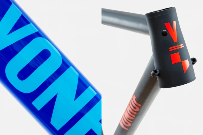
This sophisticated brand identity project for the media and entertainment sector pushes the boundaries of editorial minimalism through a masterful manipulation of tactile elements and typographic precision. Developed by Plus Mûrs, the project centers on a modular design language that navigates the intersection of rigid graphic structures and organic instability. By utilizing macro photography to capture the way water droplets distort clean, sans-serif typography, the creative team transforms static brand marks into fluid, living assets. This artistic approach, defined by high-contrast aesthetics and a clinical use of negative space, elevates standard corporate design into a sensory experience. The work leans heavily into the interplay of natural light and hard shadows, with textures ranging from high-gloss black surfaces to warm, neutral wood grain, ensuring that each application feels both industrial and deeply human. Whether rendered as vector-based posters or physical print publications, the design consistency remains striking. The rhythmic alignment of identical volumes and the strategic layering of gradients demonstrate a keen focus on visual hierarchy, successfully anchoring the brand identity in a modern, timeless aesthetic. This project serves as a compelling study in how restrained, high-key lighting and careful material selection can redefine a digital media platform, proving that the most powerful brand narratives are often told through the quiet, meticulous alignment of typography and form.