
Wagon Wheel: Brand Identity

Sep 2018
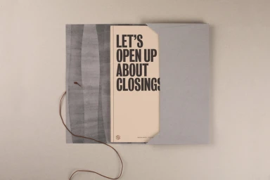
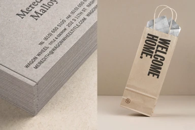
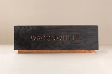
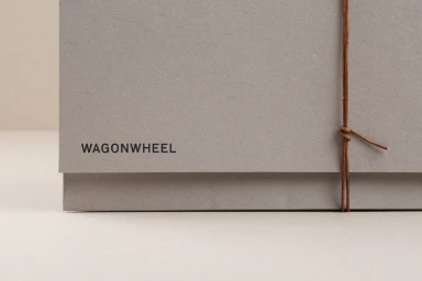
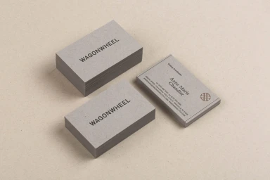
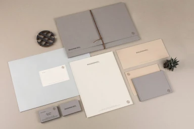
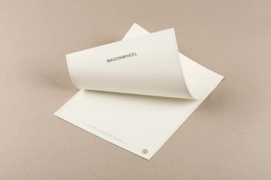
The brand identity for Wagon Wheel, crafted by Perky Bros, channels a refined sense of tactile sophistication and corporate minimalism. This comprehensive branding suite leans into a restrained color palette of charcoal, cream, and muted taupe, allowing the physical quality of the materials to take center stage. Through a thoughtful integration of emboss and deboss techniques, the design language transforms standard stationery into an immersive experience where paper texture, leather accents, and organic twine provide a grounded, professional warmth. The execution utilizes high-key lighting to emphasize depth and geometric complexity, particularly in the custom-cut wooden elements and layered collateral pieces. Each element, from the stark sans-serif typography to the deliberate use of brushed copper and charred wood, signals a commitment to precise craftsmanship. By prioritizing clean lines and a symmetrical arrangement, the project achieves an editorial minimalism that feels both contemporary and timeless. The use of macro photography captures the subtle interaction between the rugged, natural materials and the sleek, professional print work, reinforcing a cohesive brand identity that is as grounded as it is elevated. Whether through the inviting weight of textured business cards or the clever, humanizing copy found on presentation booklets, Wagon Wheel succeeds in establishing a visual vocabulary that is inherently polished, purposeful, and thoroughly professional in its corporate application.
Horizontal, Commercial, Minimalist, Clean
Typography
Advertising Campaign
