
No. Six Depot
Brand Identity
Jan 2016
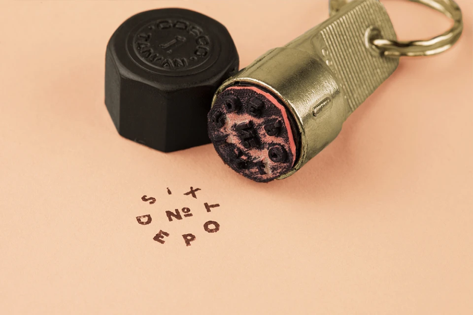
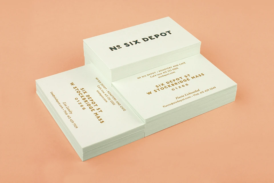
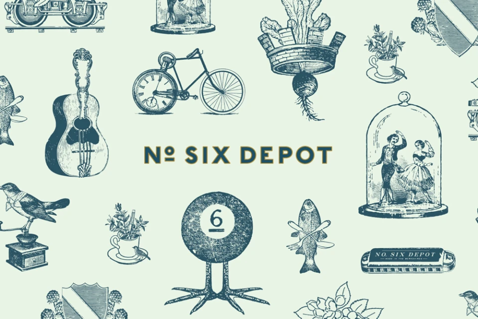
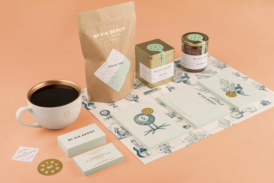
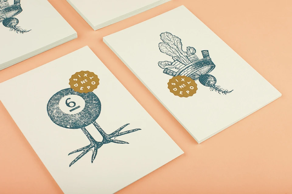
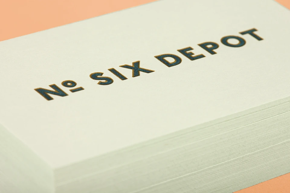
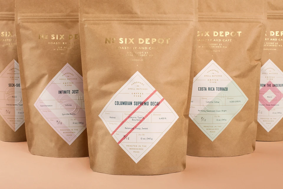
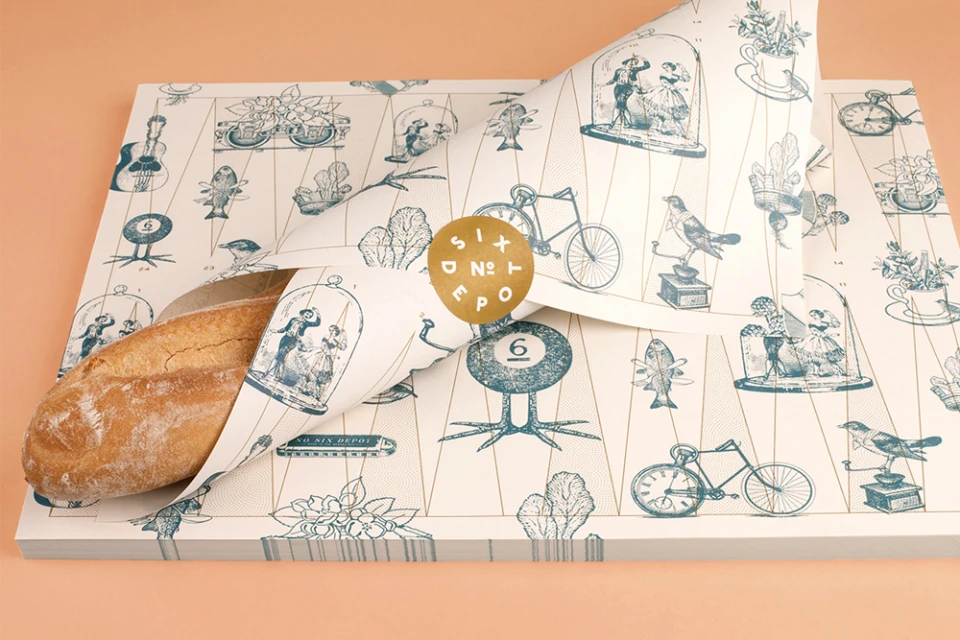
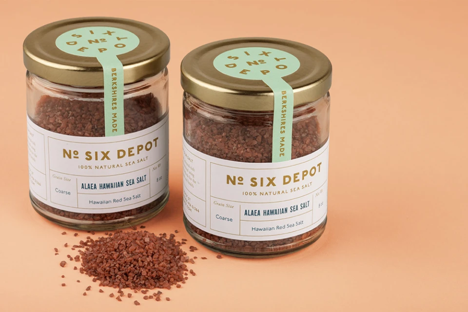
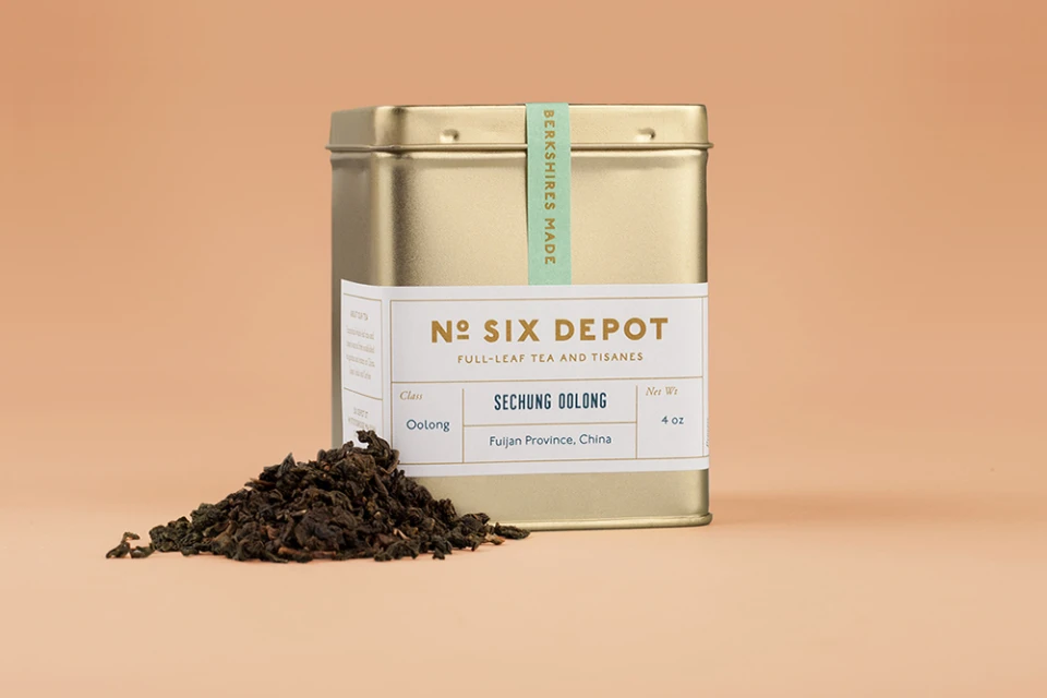
The brand identity for No. Six Depot masterfully bridges the gap between artisanal heritage and contemporary CPG design. Orchestrated by the creative team at Perky Bros, the project establishes a cohesive visual language that feels both established and refreshingly modern. By leaning into a sophisticated palette of soft peach, sage green, and metallic gold, the identity achieves a tactile, high-end feel that elevates everyday items like coffee bags, tea tins, and specialty sea salt. The execution relies on a blend of commercial studio strobe lighting and authentic printing techniques, including letterpress, screen print, and etching, to underscore the brand's commitment to craftsmanship. The graphic system is anchored by intricate, woodblock-style illustrations that nod to vintage curiosities—ranging from acoustic guitars to botanical sketches—which provide a charming, storytelling layer to the minimalist typography. Whether it is the debossed depth of the cream-colored business cards or the precision of the packaging seals, every touchpoint reinforces a consistent, elevated narrative. By balancing these traditional techniques with a clean, editorial layout, the project successfully positions No. Six Depot as a quintessential artisan brand that prioritizes quality and thoughtful design in the competitive Food & Beverage market. The result is a comprehensive suite that feels bespoke, enduring, and meticulously considered for the modern consumer.
Horizontal, Commercial, Clean
Solid Colour
E-commerce / Product
