
Cloudberry
Brand Identity




Sep 2015
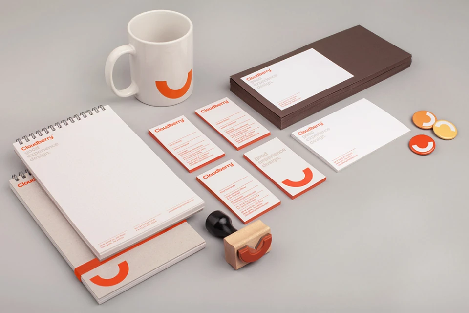
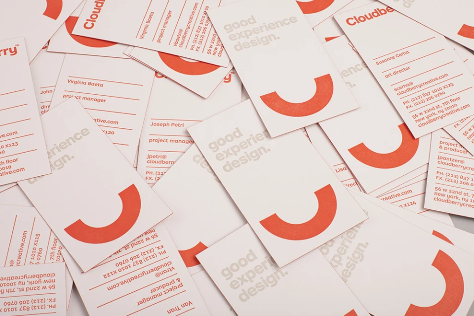
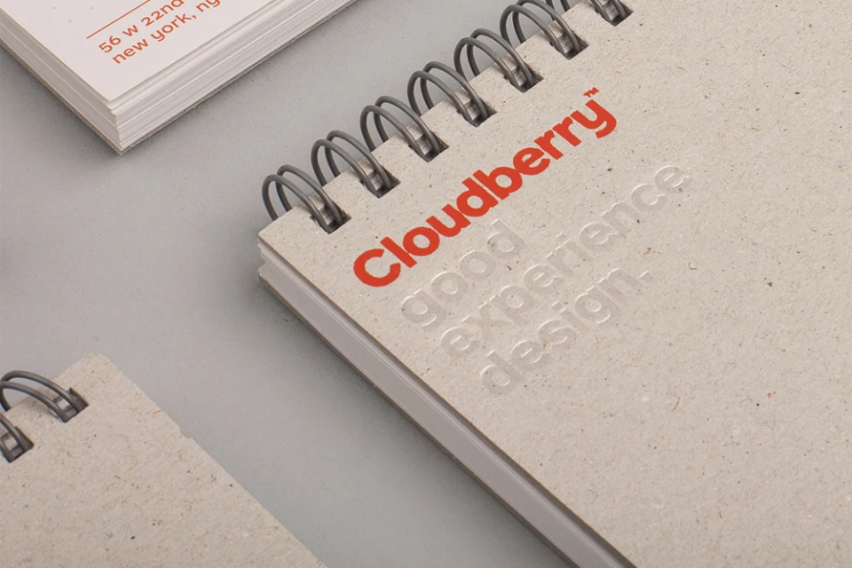
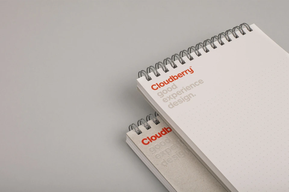
The brand identity for Cloudberry, crafted with precision by Perky Bros, establishes a distinct visual language that leans into minimalist elegance and functional clarity. The project showcases a comprehensive design system where editorial minimalism meets corporate utility, anchored by a sophisticated palette of warm orange, muted beige, and soft greys. At the heart of this identity is a commitment to good experience design, a mantra that echoes across every touchpoint from digital UI interfaces to tactile office collateral. The execution relies on a clean, modern sans-serif typography that feels both approachable and professional, complemented by a recurring semi-circular motif that serves as a playful, graphic anchor for the brand. Through the skillful use of studio strobe lighting and high-key photography, the project captures the texture of eco-friendly materials and the precision of corporate stationery with equal weight. By utilizing vector graphics and balanced compositions, the design team creates a rhythmic, cohesive narrative that stretches from business cards to physical notebooks and pins. The resulting suite is not merely a collection of assets but a strategic visual framework that prioritizes readability and brand consistency. This identity project demonstrates how deliberate graphic design can transform standard corporate materials into a cohesive brand experience that feels both human-centric and industrially refined.
Horizontal, Clean, Minimalist, Commercial
