
Velvet Coat
Brand Identity

Aug 2017
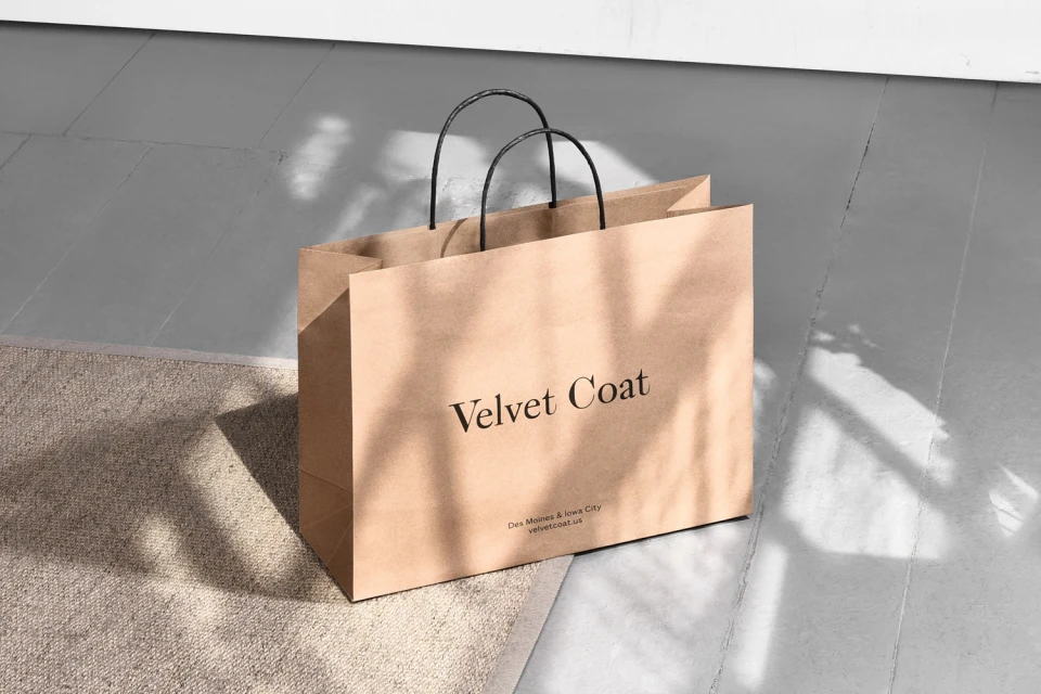
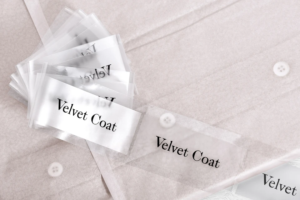
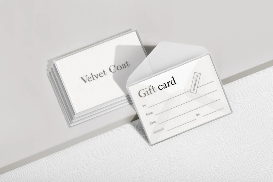
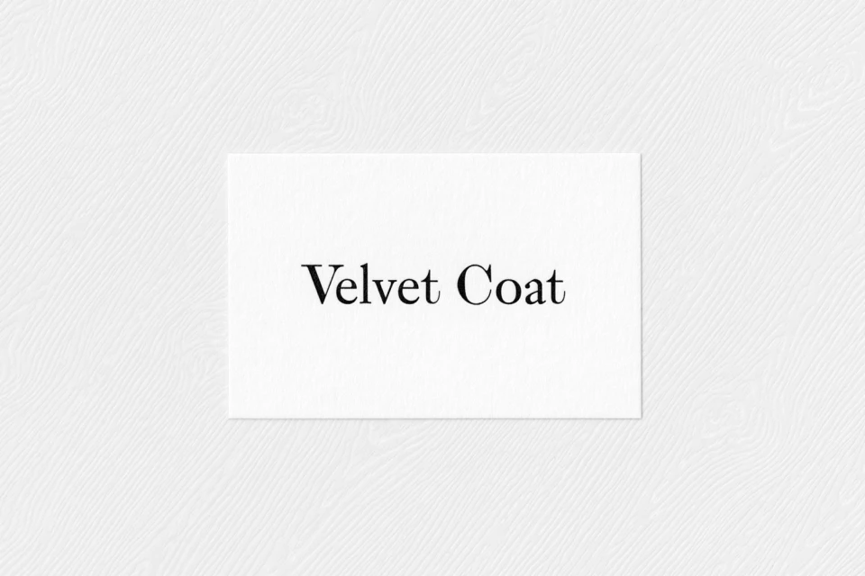
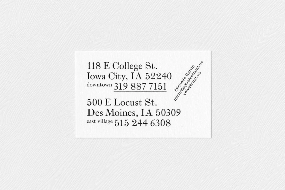
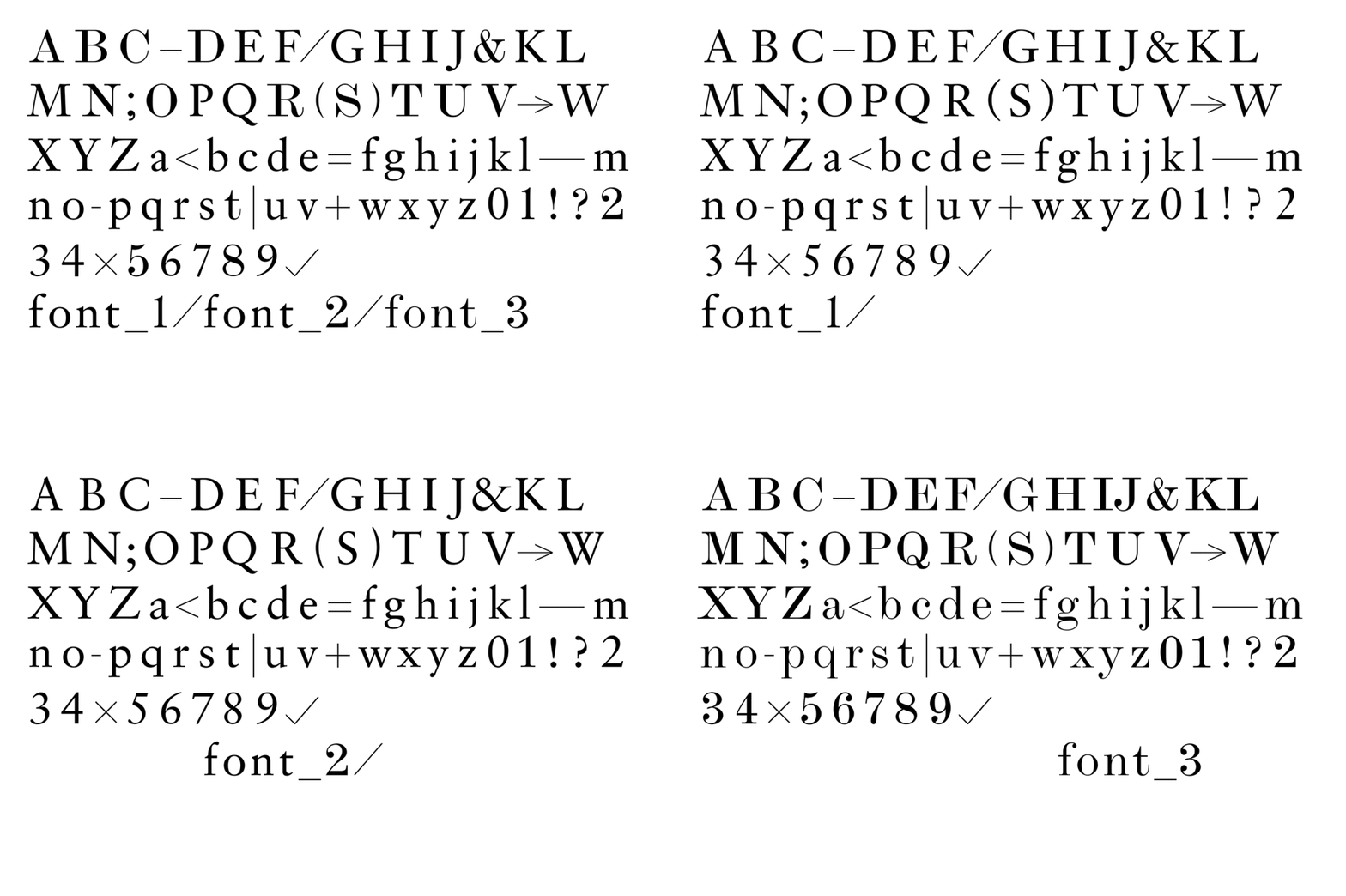
The brand identity for Velvet Coat manifests as a masterclass in editorial minimalism, grounding a retail fashion aesthetic in the quiet confidence of high-contrast serif typography. Developed by the team at Kiku Obata & Company, the identity leans into a restrained, sophisticated visual language that prioritizes tactile quality and informational clarity. Across a comprehensive suite of collateral, from translucent garment packaging and textured business cards to digital promotional assets, the design system utilizes a consistent, refined typeface that reads as both timeless and modern. The execution deftly balances commercial functionality with an elevated, boutique sensibility, employing natural light in physical photography to emphasize the rich, subtle textures of paper and fabric. In the accompanying lifestyle imagery, the brand shifts into a high-energy space, using studio strobe lighting to create a sharp contrast against a neutral backdrop, thereby allowing the vibrant color palette to pop. Whether through the symmetry of a logotype or the structured, grid-based layout of typography specimens, every element serves the objective of creating a cohesive, professional retail presence. By stripping away visual noise, the work ensures that the Velvet Coat name remains the definitive focal point, resulting in a cohesive brand identity that feels equally at home in a physical retail store as it does in a digital marketing campaign.
Horizontal, Commercial, Clean, Minimalist
Typography
