
Schema Projects
Brand Identity
May 2017
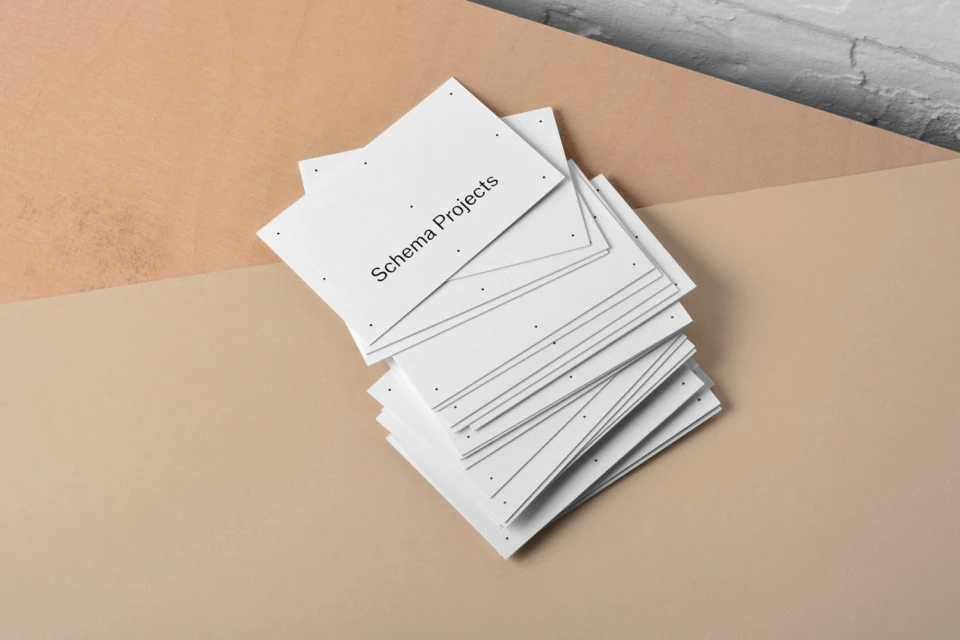
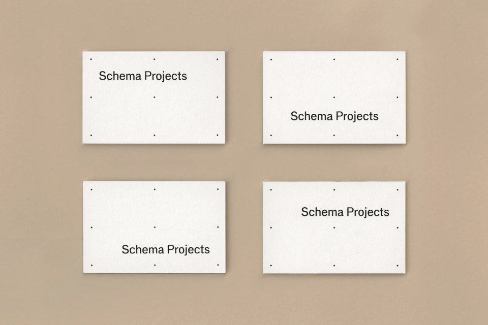
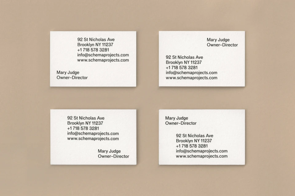
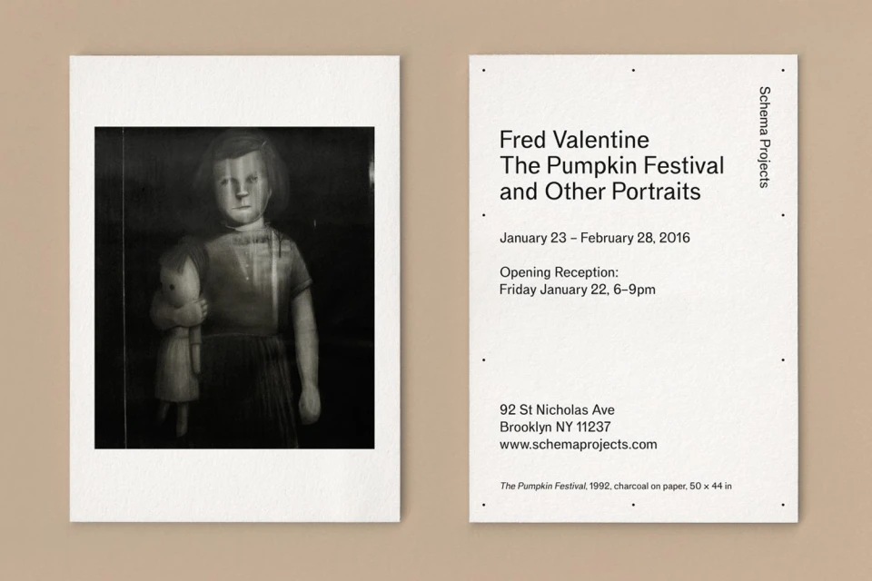
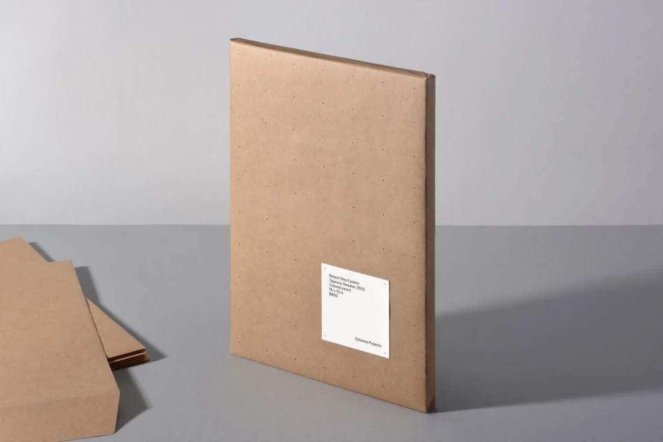
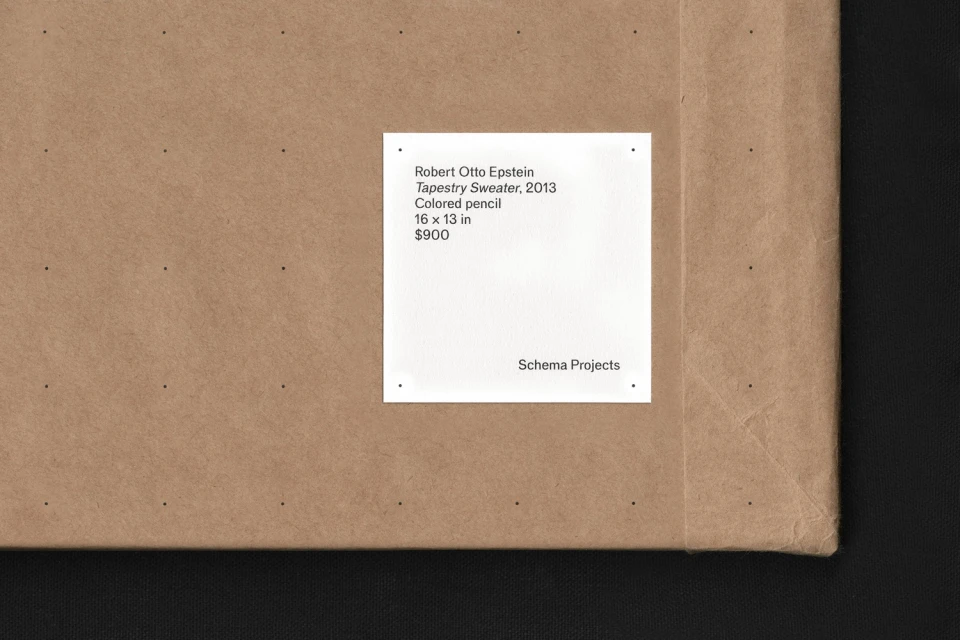
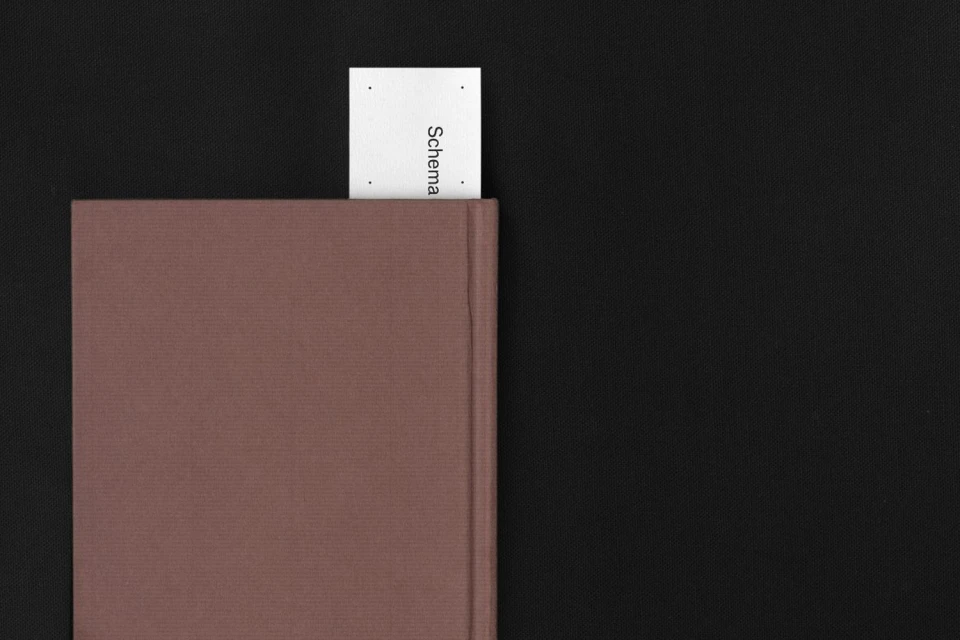
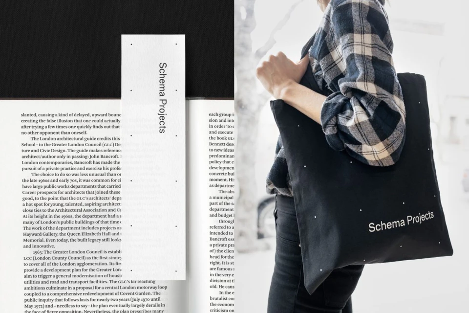
The brand identity for Schema Projects serves as an exercise in restrained elegance and structural clarity, effectively bridging the gap between corporate utility and artistic sensibility. Orchestrated with a keen eye for minimalist precision, the project channels a sophisticated visual language that prioritizes functional typography and high-contrast composition. Kiku Obata & Company delivers a cohesive system that thrives on a consistent, grid-based logic, utilizing subtle design motifs like uniform dot patterns to anchor the identity across a diverse range of touchpoints. From the tactile quality of heavy cardstock stationery to the raw texture of cardboard gallery folders, the work leans into an editorial minimalism that feels both established and intentional. The execution shifts seamlessly between the professional rigor of corporate collateral and the narrative potential of exhibition ephemera, such as the moody, charcoal-inflected portraits seen in promotional invitations. By employing techniques like studio strobe lighting to emphasize clean lines and three-dimensional forms, the brand collateral achieves a high-end, gallery-focused presence. This identity succeeds by refusing to overwhelm; instead, it relies on the deliberate placement of sans-serif type and a muted, earthy color palette to communicate authority. It is a masterclass in modular design, ensuring that every element—from tote bags to bookmarks—contributes to a unified brand narrative that is as organized as it is visually compelling.
Horizontal, Commercial, Clean, Minimalist
Typography
