
Tsuruta Architects
Brand Identity

May 2017
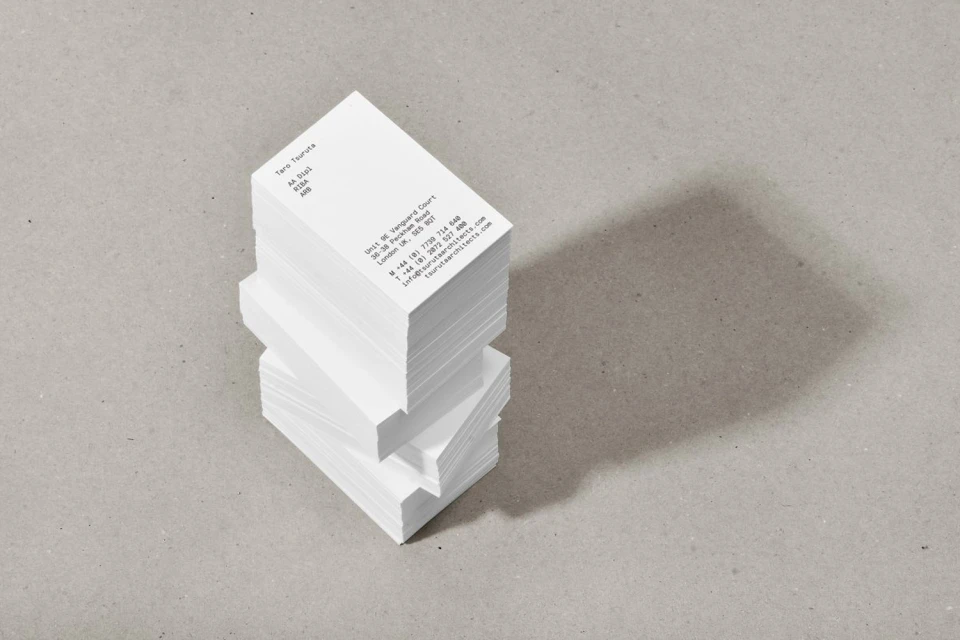
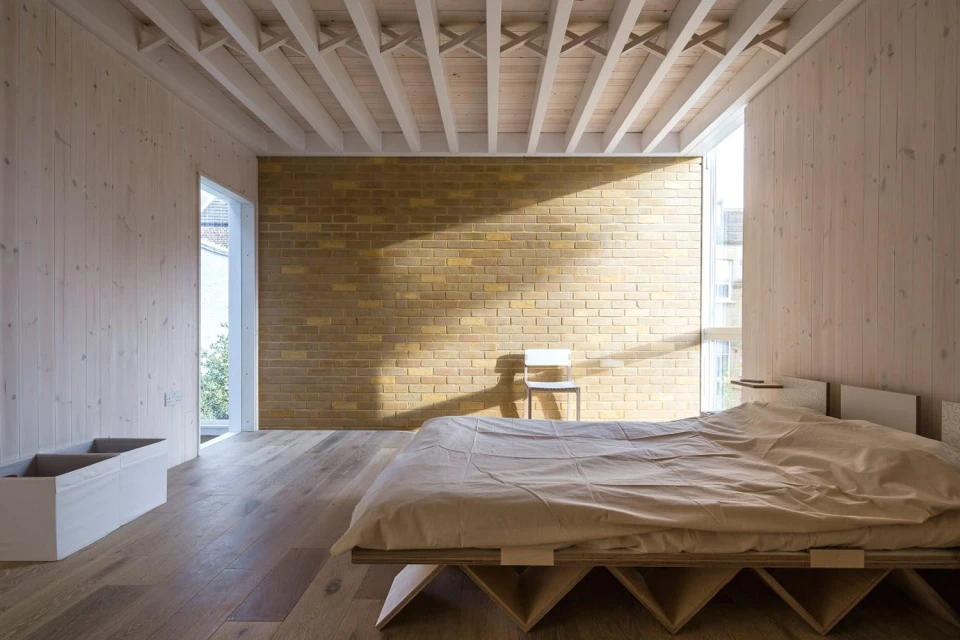
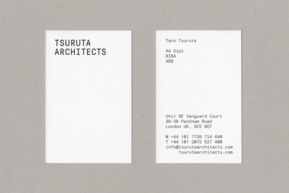
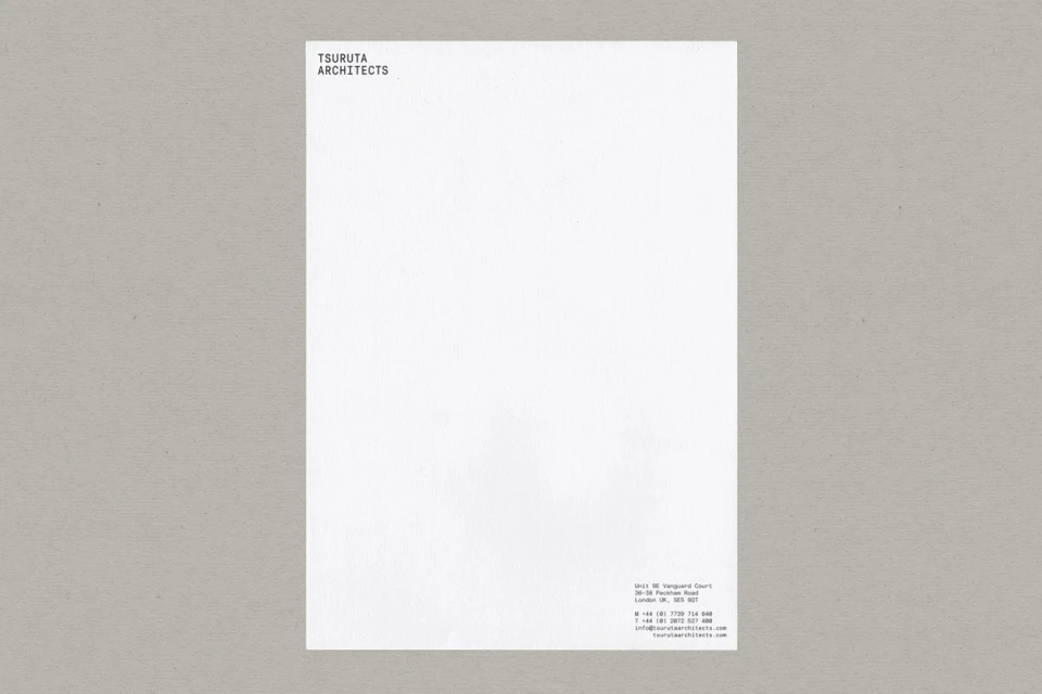
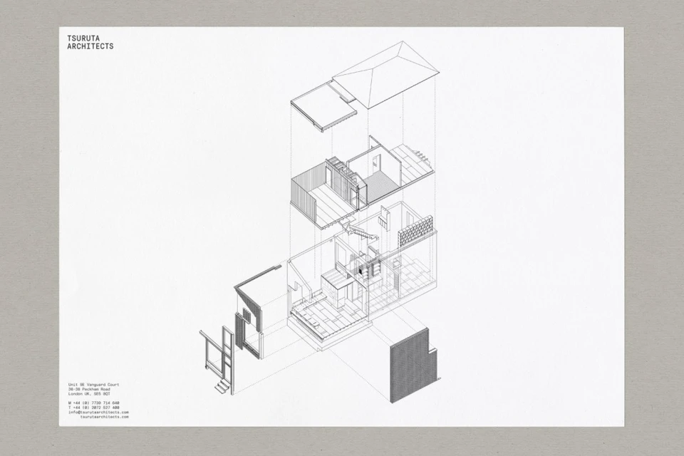
The new brand identity for Tsuruta Architects serves as a masterclass in spatial restraint and typographical precision, reflecting the firm’s core expertise in real estate and property design. By leaning into a strictly minimalist aesthetic, the project successfully bridges the gap between high-level architectural conceptualization and functional corporate collateral. The design language, expertly crafted by Kiku Obata & Company, prioritizes high-contrast black and white palettes to ensure that the identity remains as clean and structured as the physical spaces the firm conceives. Through the clever use of Typography and natural light, the campaign elevates standard business cards and stationery into cohesive brand assets that feel both tactile and technical. The imagery integrates landscape elements and isometric projections, channeling a sense of professional clarity that feels inherently modern. By utilizing low-key chiaroscuro lighting and crisp geometric compositions, the work feels grounded yet sophisticated, effectively communicating the firm’s focus on architectural integrity. Every element, from the deliberate placement of sans-serif fonts to the careful composition of structural diagrams, speaks to a contemporary branding standard that favors understated elegance over clutter. This project effectively synthesizes the intersection of academic rigor and commercial communication, proving that when architecture defines the brand, the design can be both academically precise and visually resonant for the modern real estate market.
Clean, Minimalist, Commercial
Typography
