UPPER: Brand Identity

Feb 2020
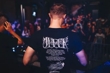
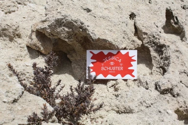
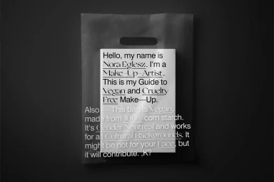
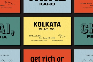
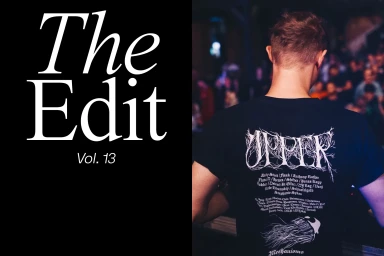
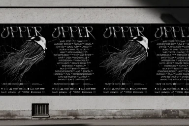
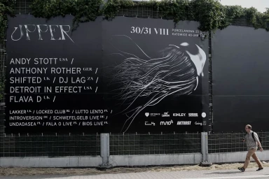
The brand identity for UPPER functions as a masterclass in minimalist design, seamlessly bridging the gap between high-end corporate communication and the raw, kinetic energy of the electronic music scene. Through a collaborative effort involving Radość Agency, Studio Joa, Martine, KR8 bureau, and Badal Patel, the visual system leans into an editorial aesthetic that prioritizes high-contrast typography and intentional negative space. The project navigates diverse applications, ranging from tactile stationery suites defined by corporate precision to large-scale, low-key environmental applications like outdoor billboards and urban postering. By utilizing a restrained palette and geometric layouts, the design team creates a cohesive brand language that feels equally at home on a matte, sustainable shopping bag as it does on a piece of streetwear worn within the moody, cinematic confines of a live music venue. These assets utilize a range of techniques, including commercial typography, documentary photography, and the use of soft light to maintain an edgy yet accessible atmosphere. Whether presented against the organic, rocky textures of a natural desert setting or a weathered concrete wall, the brand identity remains sharp and deliberate. The work consistently underscores the power of a unified visual narrative, proving that well-executed vector elements and careful font choices can elevate a brand identity into a distinct cultural statement that resonates across both digital and physical landscapes.
Horizontal, Clean