
Northern Escape: Brand Identity
Aug 2020
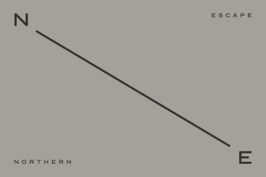
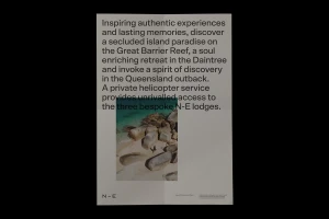
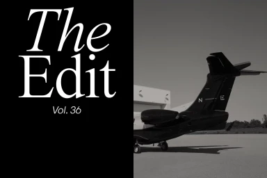
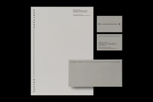
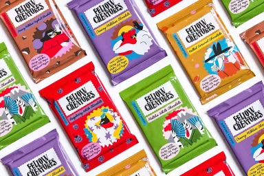
Northern Escape represents a masterclass in modern brand identity design, balancing rigorous minimalism with a tactile, editorial sensibility. Crafted through a collaborative effort involving Classmate Studio, Ryan Romanes Studio, Radość Agency, and Henry Ro, the project establishes a cohesive visual language that feels both premium and profoundly grounded. The design system utilizes a clean, sans-serif typography as its anchor, seen across a variety of corporate collateral that ranges from sophisticated letterheads and business cards with embossed details to high-contrast editorial layouts. A recurring theme of negative space and balanced composition channels a high-end corporate aesthetic, effectively elevating the brand narrative through structured, modern layouts and precise alignment. By leaning into vector-based elements, such as the minimalist N-E logo and flowing organic lines, the identity avoids unnecessary complexity in favor of clarity and impact. The work extends beyond traditional print, incorporating diverse visual storytelling techniques—from reportage-style imagery of Queensland coastlines to the playful, vibrant packaging illustrations seen in their product ventures. This multifaceted approach ensures the brand remains versatile yet instantly recognizable, proving that a disciplined design philosophy can successfully marry corporate professionalism with a distinctive, artistic edge that resonates across varied touchpoints and market segments.
Horizontal, Minimalist, Clean
Advertising Campaign


