
The New York Times: Brand Identity

May 2018
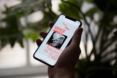
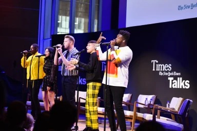
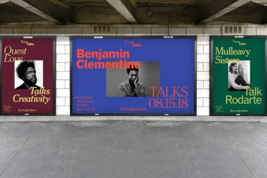
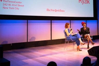
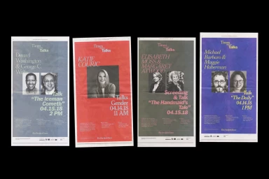
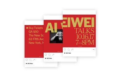
In a masterclass of institutional branding, The New York Times commissioned Base Design to craft a cohesive identity for their TimesTalks event series that bridges the gap between legacy print prestige and contemporary digital engagement. This project illustrates how a storied media publisher maintains visual authority while leaning into a vibrant, modular design language. By anchoring the identity in a disciplined grid-based layout and a sophisticated, high-contrast color palette, the designers created a flexible system that highlights diverse voices—from cultural icons like Grace Jones and Questlove to prominent journalists. The graphic execution, defined by bold serif typography and crisp vector elements, feels at once timeless and urgent. Whether applied to vertical subway posters, minimalist digital invitation mockups, or live-action stage environments, the design maintains a consistent editorial rhythm. The use of cinematic, black-and-white portraiture provides a stark, human-centric anchor against the saturated, block-color backgrounds. Through an intelligent application of UI illustration and clean, commercial aesthetic choices, the system successfully translates the weight of The New York Times into an accessible, modern lifestyle experience. The result is a sharp, professional toolkit that ensures the TimesTalks branding remains recognizable across varied touchpoints, proving that even within a rigid corporate framework, there is significant room for expressive, punchy, and highly functional graphic design.
Horizontal, Commercial, Clean, Graphic
Typography
