
The Bentway: Brand Identity



Feb 2024
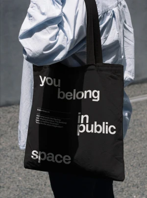
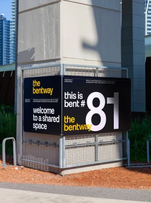
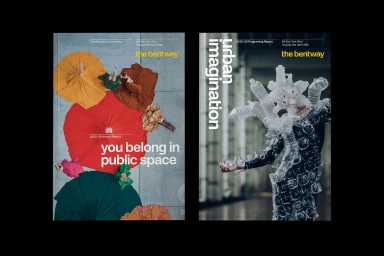
The Bentway’s brand identity, developed by SUPERFANTASTIC, centers on a bold graphic system designed for its function as an urban public space initiative. The visual language utilizes a high-contrast palette of yellow, black, and white, anchoring the brand within the architectural environment of concrete pillars and highway structures. By layering minimalist typography and custom sans-serif letterforms, the project emphasizes clarity and scale. The identity extends across diverse touchpoints, including outdoor signage, textile merchandise, and editorial publications. Motion graphics and structural photography document the initiative's focus on urban imagination, utilizing clean layouts and editorial pacing to bridge the gap between civic programming and public design.
Clean, Commercial, Horizontal
Typography
Advertising Campaign
