
St. Leo: Brand Identity

Sep 2020
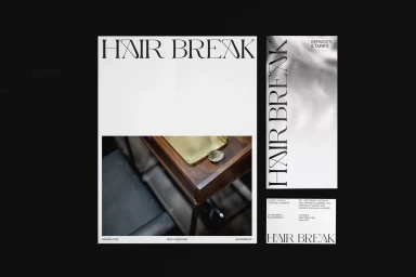
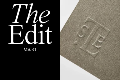
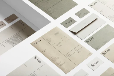
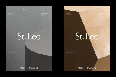
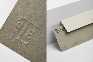
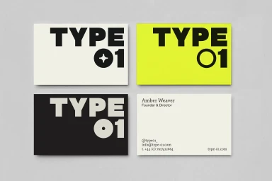
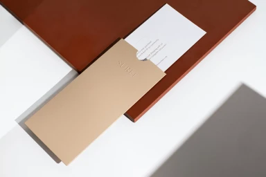
The brand identity for St. Leo is an masterclass in understated luxury, weaving together a sophisticated visual system that prioritizes tactile materiality and structural simplicity. Through a series of meticulously composed corporate collateral, the project leverages a muted, earthy palette of cream, beige, and olive green to ground its modern aesthetic. The execution relies heavily on the interplay of high-end design sensibilities and professional graphic design, utilizing techniques such as emboss and deboss to imbue stationery with a refined, premium quality. Whether presenting clean invoices and envelopes on stark white surfaces or high-contrast studio shots against natural stone, the work consistently leans into a minimalist and structured framework. Typography serves as the anchor, with elegant serif and bold sans-serif pairings creating a timeless visual language that feels both architectural and human-centric. By focusing on the interplay of negative space and rich textures, the identity system captures the essence of a brand rooted in professional refinement. Each element, from the subtle halftone gradients to the sharp, geometric angles of the business cards, contributes to a cohesive narrative of craftsmanship. This body of work, elevated by the collaboration of diverse creative voices including Alex Hunting Studio, Marion Bisserier, UNWIND, Tiffanie Mazellier, and Duane Dalton, creates a masterfully restrained brand presence that speaks to a modern, design-conscious audience.
Horizontal, Commercial, Clean, Minimalist
Typography
Advertising Campaign


