
Sabato: Brand Identity
Oct 2020
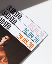
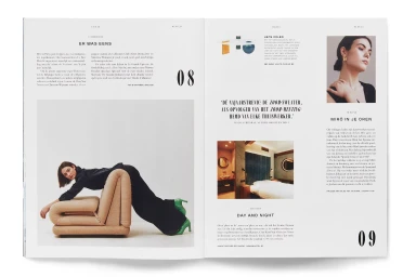
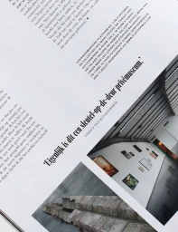
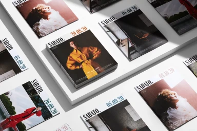
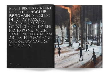
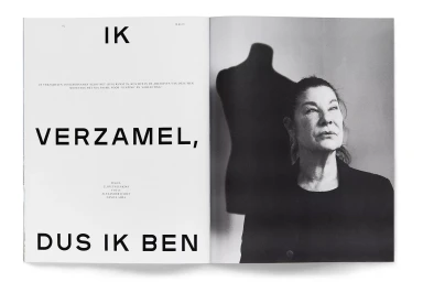
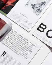
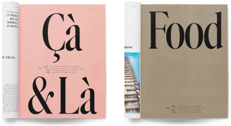
Alex Hunting Studio developed the brand identity and publication design for Sabato, a project rooted in editorial precision. The visual system centres on a clean, minimalist aesthetic, prioritising a structured grid and bold typographic hierarchy to anchor the magazine's identity. Across multiple spreads, the work demonstrates a range of editorial techniques, shifting between stark monochrome palettes and soft pastel hues. The layouts integrate large-scale serif and sans-serif typography with high-contrast photographic imagery, balancing text density with negative space to maintain pacing throughout the publication. Production values are emphasised through sharp contrast and tactile paper presentations, often using hard light to define the geometric layouts of the printed materials. The design demonstrates a consistent approach to publication layout standards and refined graphic design.
Editorial, Clean, Horizontal, Minimalist
Typography
Editorial
