
Bayntel: Brand Identity



Dec 2019
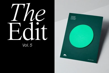
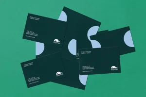
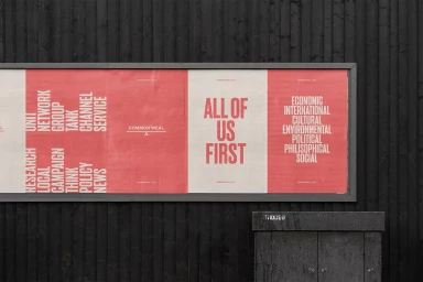
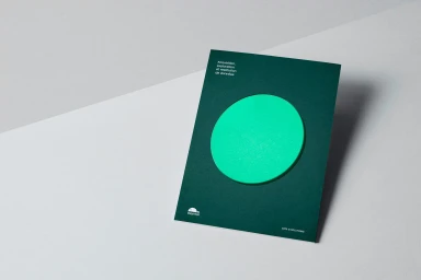
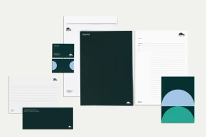
This comprehensive brand identity project for Bayntel showcases the intersection of corporate rigor and contemporary graphic design. Across a diverse portfolio of applications—from matte forest green business cards and structured stationery sets to architectural signage and large-format outdoor advertising—the identity system leans into a language of editorial minimalism. The project, brought to life through the creative expertise of Tiffanie Mazellier, Paul Belford Ltd, Tangent, Studio L'Ami, and No Service 24/7, utilizes a restrained but punchy color palette where deep dark greens and off-whites are punctuated by vibrant neon green accents. By blending commercial typography with abstract geometric motifs, the work establishes a versatile visual framework that feels both sophisticated and functional. The execution across these assets emphasizes high-contrast design choices and clean, intentional lines, whether manifested in the tactile grain of physical paper or the precision of a 3D render. This identity design captures a cohesive brand presence that translates seamlessly between physical objects and urban environments. Through deliberate light-play and sharp vector-driven compositions, the collective output reinforces Bayntel as a modern, forward-thinking entity. The result is a rigorous study in brand consistency, where every element—from the stylized logo to the layout of internal communications—serves to elevate the brand’s professional stature while maintaining a distinct, modern character that stands out in the crowded corporate landscape.
Horizontal, Clean, Minimalist, Commercial


