
Brand
ProjectBrand Identity
St. Leo Brand Identity 2020
Associated creatives


Tags
Description
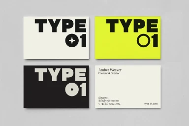
This presentation showcases a comprehensive brand identity project for St. Leo, featuring four distinct business card layouts arranged neatly on a neutral grey surface. The composition utilizes a clean, modern aesthetic with high-contrast colour blocks including off-white, vivid lime green, and jet black. Bold, heavy sans-serif typography spells out TYPE 01 alongside geometric and star symbols across the front designs. The bottom right card provides essential contact details in a refined, minimalist serif typeface for Founder and Director Amber Weaver. The overall aesthetic is polished, structured, and contemporary, reflecting deliberate typographic hierarchy and clean graphic design.