
Parking Riponne SA
Brand Identity
Sep 2020
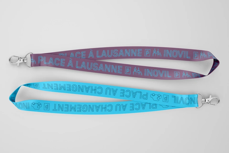
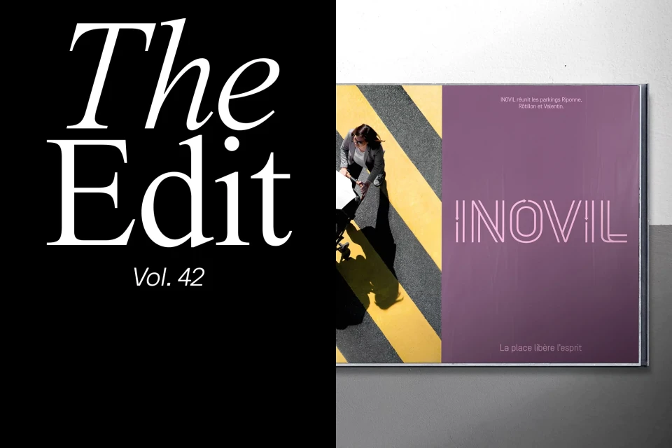
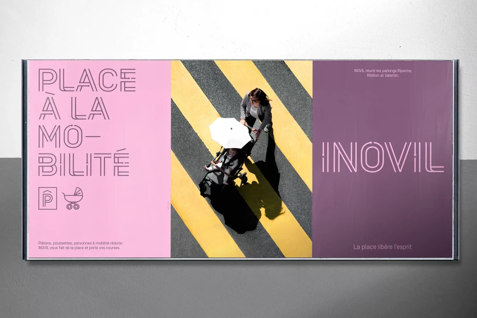
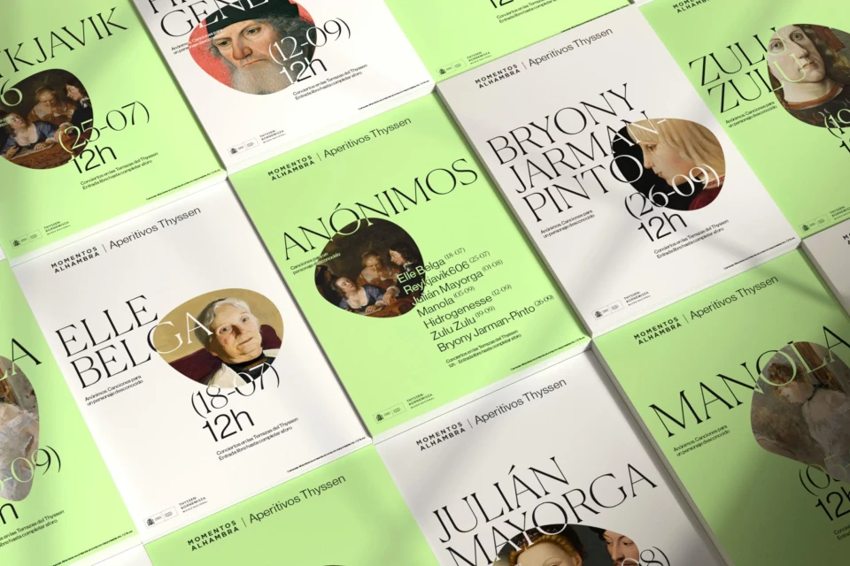
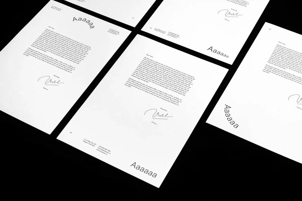
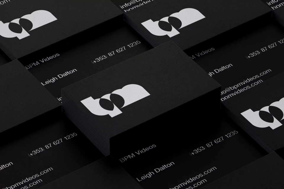
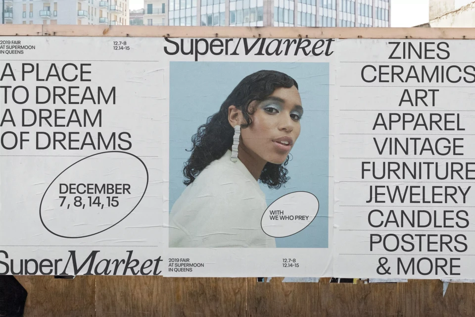
The brand identity overhaul for Parking Riponne SA masterfully translates the necessity of urban infrastructure into a sophisticated visual language. By moving beyond utilitarian tropes, the project creates a cohesive ecosystem that bridges corporate clarity with contemporary artistic flair. The design team, including contributions from Arce Studio, The Lab, Ross Gendels, and Duane Dalton, employs a rigorous grid-based approach to layout and typography that anchors the brand in a professional, high-contrast aesthetic. Across a diverse range of touchpoints—from high-utility fabric lanyards to structured event signage and stationery—the system utilizes bold color blocking and minimalist graphic icons to simplify complex wayfinding and brand communication. This corporate design initiative leans into a refined vector-based workflow, ensuring that the identity remains scalable and precise across both printed collateral and digital applications. By balancing sharp, modern serif typefaces with organic, top-down photography and fragments of classical fine art, the project elevates the brand experience, effectively turning standard parking facility communications into a series of curated, high-end artifacts. The result is a clean, modular, and deeply intentional design system that reflects a clear commitment to precision, proving that even the most functional commercial entities can thrive through disciplined, art-forward branding strategies that maintain visual consistency while inviting human engagement and curiosity.
Horizontal, Commercial, Clean


