
OM130: Brand Identity
Mar 2021
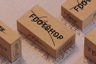
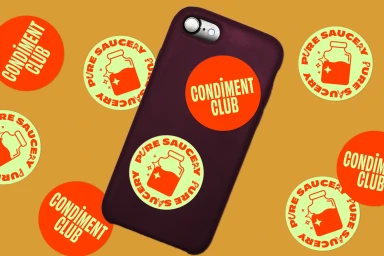
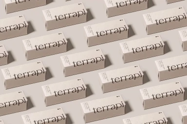
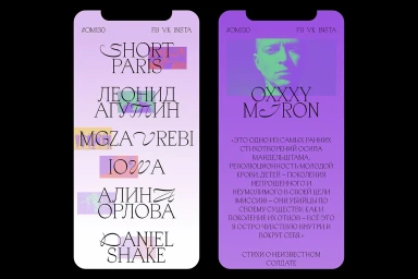
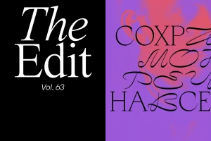
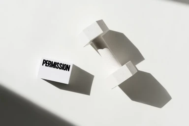
The OM130 brand identity project establishes a cohesive visual language across both physical packaging and digital interfaces. Utilizing a minimalist approach, the design system employs a stark color palette of purple, red, and white, contrasted with neutral beige and earth-toned surfaces. The execution highlights structured layout grids and the use of clean serif typography to create a sense of geometric rhythm and depth. Techniques such as 3D render / CGI and motion graphics are used to animate the brand's typographic assets, ensuring a consistent presence across diverse touchpoints. The project includes creative contributions from Vanderbrand, Studio Najbrt, Tuman Studio, and UNWIND, focusing on high-contrast graphic design and kinetic text elements to define the brand's contemporary aesthetic.
Horizontal, Commercial, Graphic


