
Brand
ProjectBrand Identity
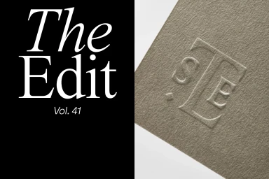
St. Leo Brand Identity 2020
Associated creatives


Tags
Description
This brand identity project for St. Leo features a striking split-screen composition. The left side presents bold white serif typography against a solid black background, reading The Edit Vol. 41. The right side displays a textured taupe paper surface featuring a sophisticated debossed monogram logo. The clean lines and tactile materials reflect refined corporate and editorial art direction.